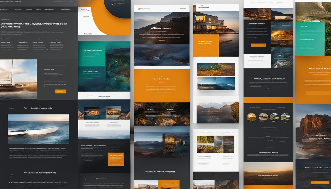
Designing websites for mobile devices has been a popular topic in recent years, but it’s equally important to consider the experience on larger screens. Responsive design ensures a seamless user experience across various devices, including large screens.
Key Takeaways:
- Responsive design is crucial for providing a user-friendly interface on large screens
- Designing for different screen sizes requires careful layout and adaption considerations
- Balance and grids contribute to visually appealing and user-friendly designs
- Choosing the right colors and graphics enhances the overall aesthetic
- Typography plays a vital role in readability and visual appeal
The Importance of Responsive Design
Responsive web design is paramount when it comes to creating a user-friendly interface on large screens. With the proliferation of different devices and screen sizes, it’s crucial for designers to create layouts and elements that can adapt seamlessly. By embracing responsive design principles, we can ensure that our websites provide an optimal viewing experience and avoid usability issues on larger screens.
One of the key features of responsive design is its ability to create flexible layouts. This means that the elements on a webpage automatically adjust their size and position based on the screen size of the device being used. This ensures that users are able to navigate the website without cumbersome scrolling or zooming, regardless of whether they’re using a desktop computer, a tablet, or a large-screen smartphone.
Another important aspect of responsive design is the use of fluid elements. These elements, such as images and videos, are designed to expand and contract based on the available screen space. This ensures that the content is always displayed in an optimal and visually appealing manner, regardless of the device being used.
When implementing responsive design, it’s crucial to optimize the user interface specifically for large screens. This involves strategically adjusting the layout and design elements to take advantage of the increased screen real estate. By ensuring that the content is visually balanced, appropriately sized, and thoughtfully arranged, we can create a seamless and engaging experience for users on large screens.
Incorporating responsive web design not only enhances the user experience but also has other benefits. It can improve search engine visibility by complying with Google’s mobile-friendly requirements, as well as reducing maintenance efforts by having a single codebase that caters to various devices.
Crafting a user-friendly interface on large screens through responsive design requires careful planning and implementation. By considering the fluidity of layouts and elements, we can ensure that our websites provide a visually appealing and enjoyable experience for users across a range of screen sizes.

Key Points:
- Responsive web design is crucial for creating a user-friendly interface on large screens.
- Flexible layouts and fluid elements automatically adjust to different screen sizes.
- Optimizing the user interface specifically for large screens enhances the viewing experience.
- Responsive design has additional benefits for SEO and maintenance efforts.
Designing for Different Screen Sizes
When it comes to designing websites, it’s essential to consider the layout and adaptation for different screen sizes. While full-width designs can provide a fully immersive browsing experience, they can also result in usability issues on larger screens. On the other hand, fixed width layouts offer more control but can feel forced and restrictive.
At our First source, we understand the importance of finding a happy medium that ensures an optimal viewing experience for users on all devices. One way to achieve this is by implementing maximum widths for blocks of copy. By doing so, we can enhance readability and maintain a visually appealing design.
“Designing for optimal viewing experience requires a careful balance between full-width and fixed width layouts. Implementing maximum widths for blocks of copy is an effective way to enhance readability and maintain a visually appealing design.”
Optimal viewing experience is crucial in today’s digital landscape, where users access websites on a wide range of devices with varying screen sizes. By considering the layout and adaption of the website, we can create a design that caters to the needs of users on bigger screens while delivering an exceptional user experience.

Comparing Full-Width and Fixed Width Layouts
| Full-Width Layouts | Fixed Width Layouts | |
|---|---|---|
| Advantages |
|
|
| Disadvantages |
|
|
| Recommended Use |
|
|
Achieving Balance and Grids in Web Design
When it comes to web design, balance and grids are two essential elements that contribute to creating visually appealing and user-friendly interfaces. Let’s dive into the importance of achieving a balanced design and utilizing grids to compartmentalize the design and improve readability.
The Power of Balanced Design
Balance is all about creating symmetry or asymmetry in the visual weight of design elements. A well-balanced design ensures that no single element overpowers the others, creating a harmonious composition. By distributing visual weight evenly, we create a sense of equilibrium that is pleasing to the eye.
Whether it is through symmetrical or asymmetrical balance, we can guide the user’s attention to key elements, emphasizing their importance. This strategic approach enhances the overall user experience, making it easier for users to navigate through the website and find the information they need.
Compartmentalizing Design Using Grids
Grid systems play a crucial role in compartmentalizing the design and improving readability. By dividing the layout into columns and rows, we create a structure that organizes content and elements in a logical and consistent manner.
Using grids allows us to align different design elements, such as text blocks, images, and navigation menus, to create a visually cohesive and organized layout. This consistent structure improves the overall readability of the website, making it easier for users to scan and comprehend the content.
The Benefits of Balance and Grids
By achieving a balanced design and utilizing grids, we can create websites that not only look visually appealing but also provide a seamless user experience. Here are some key benefits:
- Improved visual hierarchy, guiding users to important content
- Enhanced readability and comprehension
- Consistency in design across different screen sizes
- Efficient use of space
- Streamlined navigation
By incorporating balance and grids into our web designs, we enable users to interact with our websites effortlessly, leading to higher engagement and satisfaction.
Remember, achieving balance and utilizing grids is just one aspect of effective web design. In the next section, we will explore the importance of selecting colors and graphics to create visually appealing designs.

Selecting Colors and Graphics
When it comes to creating visually appealing designs, selecting the right colors and graphics is crucial. A well-chosen color palette can significantly enhance the overall aesthetic of a website and create a cohesive and harmonious visual experience. Graphics, on the other hand, should be carefully chosen and strategically placed within the design to complement the content without overpowering or distracting from it.
The first step in choosing colors is to establish a cohesive color palette. This involves selecting a set of colors that work well together and reflect the desired aesthetic and brand identity. Consider the emotions and associations that different colors evoke and select those that align with the website’s purpose and target audience. For example, vibrant and energetic colors may be ideal for a website catering to a young and dynamic audience, while calming and soothing colors may be more appropriate for a wellness or relaxation-oriented website.
Graphics play a significant role in enhancing the visual appeal of a design. They can add depth, texture, and visual interest to the overall composition. When selecting graphics, it is crucial to consider their relevance to the content and the overall design concept. They should support and enhance the message being conveyed without detracting from it. Whether it’s illustrations, photographs, or icons, each graphic element should be purposefully chosen and positioned to create a visually engaging and cohesive design.
“The right color palette and thoughtful use of graphics can elevate a design from ordinary to extraordinary.”
Example:
| Color Palette | Graphics |
|---|---|
|
|

By carefully selecting colors and graphics, designers can create visually appealing designs that capture the attention of users and convey information more effectively. A well-executed color palette and thoughtful use of graphics contribute to a visually cohesive and impactful design.
Typography and Readability
When it comes to web design, typography holds immense power in both readability and visual appeal. The right choice of fonts, sizes, and spacing can significantly impact how users interact with the content. One important aspect of typography that should not be overlooked is fluid typography.
Fluid typography refers to the practice of ensuring that text scales proportionally with screen size. This technique allows for a seamless reading experience on various devices, from large desktop screens to small mobile screens. With fluid typography, we can maintain legibility and create a harmonious balance between the text and other design elements.
Font stacks are instrumental in achieving consistent typography across different devices. By defining the order of fonts in the stack, we can ensure that if the primary font is not available on a particular device, a suitable alternative will be used. This maintains the intended visual aesthetic and readability across all platforms.
Below is an example of how fluid typography can enhance the readability and visual appeal of a website:
“Fluid typography has revolutionized the way we design websites. The responsive nature of the text allows users to have a consistent reading experience, whether they access the website from their desktop computers or mobile devices. Implementing fluid typography has significantly improved the readability of our content and brought a harmonious balance to our designs.”

| Typography and Readability Benefits | Example |
|---|---|
| Improved readability on different screen sizes | Increase font size proportionally for better legibility on smaller screens |
| Enhanced visual appeal and design harmony | Consistent font scaling ensures a balanced composition with other design elements |
| Accessible reading experience for all users | Adaptable typography caters to users with different visual needs |
By implementing fluid typography and utilizing font stacks, we can create visually appealing designs that enhance the readability and ensure a harmonious balance with other elements on the page. This user-centered approach contributes to a seamless browsing experience across a range of devices, allowing us to maximize the impact of our web design.
Testing and Optimization
Regular testing across devices is essential to ensure a seamless user experience. It’s important to remember that emulators and testing tools can only simulate different screen sizes to a certain extent. Real-world testing on physical devices provides more accurate insights into how users interact with the website or application.
Optimizing images and media for different resolutions and connection speeds is crucial for improving performance and enhancing user satisfaction. High-resolution images can slow down load times, leading to a frustrating experience. By resizing and compressing images, we can strike a balance between visual quality and loading speed.
Online tools such as Google PageSpeed Insights can help identify areas for improvement and suggest optimization techniques. This could include compressing files, leveraging browser caching, and minifying CSS and JavaScript to reduce file sizes and improve loading times.
Below is an example of a table summarizing the testing and optimization recommendations:
| Testing and Optimization Recommendations | Benefits |
|---|---|
| Conduct real-world testing on various devices | Accurate insights into user experience |
| Optimize images for different resolutions | Improved performance and faster loading times |
| Resize and compress images | Balance between visual quality and loading speed |
| Use online tools for performance analysis | Identify areas for improvement and optimization suggestions |
By prioritizing testing and optimization, we can ensure that our websites and applications deliver a consistent and enjoyable user experience across devices of different resolutions.
Creating Consistency and Navigation Design
In the world of web design, consistency is key to providing a seamless user experience. Whether users are browsing on a desktop, laptop, or mobile device, maintaining design consistency across different screen sizes is crucial. It ensures that users can navigate and interact with your website effortlessly, no matter the device they are using.
One aspect of design consistency is the navigation menu. When users visit your website on a larger screen, they expect to see the same navigation options as they would on a smaller screen. This means that the main menu, dropdown menus, and other navigation elements should remain consistent across devices. By doing so, you create familiarity and make it easier for users to find their way around your site.
Flexible Navigation Designs for Smaller Screens
While consistency is important, it’s also essential to adapt the navigation design for smaller screens. On mobile devices with limited screen real estate, traditional navigation menus may take up valuable space and hinder the user experience. To overcome this challenge, consider implementing flexible navigation designs that enhance usability on smaller screens.
Collapsible menus are a popular choice for responsive web design. They allow users to expand and collapse the menu as needed, conserving screen space while still providing access to all the necessary navigation options. Another option is icon-based navigation, where a small menu icon expands into a full menu when clicked or tapped. This approach offers a clean and compact navigation solution for mobile devices.
By embracing flexible navigation designs, you can ensure that users can easily navigate your website on any screen size, from large desktop monitors to small smartphones.
“Consistency in design elements, such as navigation menus, is crucial for providing a seamless user experience. However, we must also adapt the navigation design to maximize usability on smaller screens.”

The Benefits of Design Consistency
Design consistency goes beyond just navigation. It encompasses all design elements on your website, including buttons, branding, typography, and color schemes. When these elements remain consistent, it creates a sense of cohesiveness and professionalism. Users are more likely to trust and engage with a website that has a consistent, well-designed interface.
Consistency also simplifies the user experience. When users are familiar with how certain elements function and look, they can navigate your website more easily. This reduces confusion, frustration, and the risk of users abandoning your site.
The Role of Navigation Design in SEO
Design consistency and flexible navigation also have important implications for search engine optimization (SEO). A well-designed and consistent website structure with clear navigation paths helps search engine bots crawl and understand your site, improving its visibility in search results. Additionally, a positive user experience due to consistent navigation design can lead to increased engagement, lower bounce rates, and an extended time spent on your website, all of which positively impact your SEO efforts.
Creating design consistency and implementing flexible navigation designs are integral parts of web design that contribute to a user-friendly and engaging experience across different screen sizes. By prioritizing these aspects, you can ensure that users can easily navigate and interact with your website, building trust, maximizing engagement, and ultimately achieving your business goals.
Conclusion
Designing for different screen sizes requires a user-centered approach, technical expertise, and meticulous testing. As web designers, it is our responsibility to ensure that websites deliver a seamless user experience across all devices, regardless of their screen size.
One of the key strategies we employ is responsive design. By prioritizing mobile-first principles, we create interfaces that adapt effortlessly to different screens. This approach allows us to provide an optimal viewing experience by adjusting elements and layouts accordingly. Through this responsive design strategy, we cater to the needs of users on both large and small screens.
Optimizing images and media is another crucial aspect of designing for diverse screen sizes. By optimizing these assets, we enhance performance and user satisfaction across different resolutions and connection speeds. It ensures a smooth browsing experience, regardless of the device being used.
Moreover, we consider touch interactions, maintaining design consistency, and ensuring accessibility. By implementing intuitive touch gestures and controls, users can easily navigate the website with their fingertips. Design consistency, from navigation menus to branding, creates a cohesive user experience. And finally, accessibility measures ensure that everyone can access and interact with the website, regardless of their abilities or the devices they use.
In conclusion, by employing responsive design strategies, prioritizing mobile-first principles, and optimizing images and media, we can successfully design for different screen sizes. By considering touch interactions, maintaining design consistency, and ensuring accessibility, we provide a seamless user experience across a diverse range of devices. So, let’s always remember to design with the user in mind and embrace the ever-changing landscape of technology.
FAQ
What is responsive design?
Responsive design is a web design approach that ensures a seamless user experience across various devices, including large screens. It involves creating flexible layouts and fluid elements that automatically adjust to different screen sizes.
Why is responsive design important for providing a user-friendly interface on large screens?
Responsive design is crucial for providing a user-friendly interface on large screens because it ensures optimal viewing experiences and avoids usability issues. By embracing responsive design, designers can create websites that adapt to different screen sizes, providing an optimal user experience.
How do you design for different screen sizes?
Designing for different screen sizes requires considering the layout and adaption of the website. Finding a balance between full-width designs and fixed-width layouts can enhance readability and maintain a visually appealing design. Implementing maximum widths for blocks of copy can also contribute to a better user experience.
What is the role of balance and grids in web design?
Balance and grids are essential elements of web design. With a balanced design, the visual weight is evenly distributed, creating symmetry or asymmetry. Grids help compartmentalize the design and improve readability by using columns. A well-constructed balance and grid system contribute to a visually appealing and user-friendly interface.
How do you select colors and graphics for web design?
When selecting colors, it is important to choose a cohesive color palette that complements each other. Graphics should be carefully chosen and placed thoughtfully within the design. They should enhance the overall aesthetic without overpowering or distracting from the content.
What is the role of typography in web design?
Typography plays a vital role in both readability and visual appeal. Implementing fluid typography ensures that text scales proportionally with screen size, maintaining legibility and harmonious balance with other design elements. Font stacks, which define the order of fonts, can be used to maintain consistent typography across different devices.
Why is testing and optimization important for web design?
Regular testing across various devices is essential to ensure a seamless user experience. Real-world testing on physical devices provides more accurate insights than emulators and testing tools. Optimizing images and media for different resolutions and connection speeds improves performance and user satisfaction.
How do you create consistency in web design?
Consistency in design elements such as navigation menus, buttons, and branding is crucial for providing a cohesive user experience. Designers should ensure that these elements remain consistent across different screen sizes. Flexible navigation designs, such as collapsible menus or icon-based navigation, enhance usability on smaller screens.
What are some strategies for designing for different screen sizes?
Designing for different screen sizes requires a user-centered approach, technical expertise, and meticulous testing. Strategies such as responsive design, prioritizing mobile-first principles, and optimizing images and media contribute to creating adaptable interfaces. By considering touch interactions, maintaining design consistency, and ensuring accessibility, designers can provide a seamless user experience across a diverse range of devices.
Leave a Reply