At WebsiteDesigner.Business, we understand the importance of having a strong online presence. With the majority of people using smartphones for browsing, it’s crucial to optimize your website for both mobile and desktop platforms. That’s where our expertise in web design for mobile and desktop comes in.
Responsive web design is the key to ensuring your website looks and functions flawlessly across different devices. Whether it’s a mobile phone, tablet, or computer, your website should adapt seamlessly to provide an optimal user experience. Our team of experts specializes in creating mobile-friendly websites that are visually appealing, user-friendly, and accessible.
With mobile-first design, we prioritize the mobile experience to cater to the needs of your mobile users. By putting mobile users first, we ensure that your website is designed to perform exceptionally on smaller screens. This approach not only enhances user experience but also improves your website’s visibility in search engine results.
In the fast-paced digital world, cross-platform web design is essential. Your website should deliver a consistent and cohesive experience across different devices and platforms. Our adaptive web design approach guarantees that your website functions seamlessly, irrespective of the operating system or browser your visitors use.
Don’t let your website fall behind the competition. Our mobile optimization strategies will help you capture the attention of your target audience and boost conversions. From user-friendly web design to multi-device compatibility, we have the expertise to take your online presence to the next level.
Key Takeaways:
- Responsive web design ensures a seamless user experience on both mobile and desktop platforms.
- Mobile-first design prioritizes the mobile user experience, enhancing visibility and engagement.
- Cross-platform web design guarantees consistency across different devices and platforms.
- Mobile optimization strategies increase conversions and capture the attention of your target audience.
- User-friendly web design and multi-device compatibility are essential for a successful online presence.
The Importance of Mobile-Friendly Websites
Mobile-friendly websites are crucial in today’s digital landscape. With over 75% of website visits coming from mobile devices, it’s important to ensure your website is optimized for mobile. A mobile-friendly website improves user experience, increases reach and visibility, reduces bounce rate, and boosts SEO ranking. It also leads to speedy loading times, higher conversion rates, increased online sales, and better social media shares. Don’t overlook the importance of having a mobile-friendly website for your business.
| Benefits of Mobile-Friendly Websites: | Statistics and Insights: |
|---|---|
| Improved User Experience | Over 75% of website visits are from mobile devices. |
| Increased Reach and Visibility | A mobile-friendly website reduces bounce rate. |
| Higher Conversion Rates | Faster loading times lead to better SEO ranking. |
| Increased Online Sales | Mobile optimization improves social media shares. |
| Better Social Media Shares | A mobile-friendly website boosts revenue. |
Responsive Design for a Seamless Experience
A crucial aspect of mobile-friendly websites is responsive design. By using custom CSS and responsive design techniques, your website will automatically adapt to different screen sizes and deliver an optimal user experience on any device. This ensures that your content is readable, images load correctly, and navigation remains user-friendly, maximizing the potential for engagement and conversions across all mobile devices.
“Mobile optimization is no longer a luxury; it’s a necessity for businesses to thrive in the digital age.” – Industry Expert
Having a mobile-friendly website not only improves your online presence but also contributes to the overall success of your business. It enhances user experience, increases customer satisfaction, and drives revenue growth. Don’t miss out on the opportunity to leverage the power of mobile optimization and create a seamless user experience that keeps your audience engaged and coming back for more.

Stay ahead of the competition and make the most of your online presence with a mobile-friendly website. Optimize your website now to attract more visitors, improve search engine rankings, and increase revenue. Trust in our expertise to design and develop a mobile-friendly website tailored to your business needs.
Tips for Designing a Mobile-Friendly Website
When it comes to mobile website design, simplicity and ease of use are key. With the increasing number of users accessing the web from their mobile devices, it’s crucial to ensure your website is optimized for mobile viewing. By following these tips, you can create a mobile-friendly website that provides a seamless user experience.
- Simplify Navigation: Design a simple and intuitive navigation menu that allows users to find what they’re looking for easily. Avoid complicated dropdown menus and excessive scrolling.
- Quick Loading Time: Optimize your website to load quickly on mobile devices. Minimize large image files, use browser caching, and reduce the number of HTTP requests to improve loading speed.
- Clear Call-to-Action: Make sure your call-to-action buttons are easily visible and encourage users to take desired actions. Use clear and concise wording to guide users towards specific goals, such as making a purchase or signing up for a newsletter.
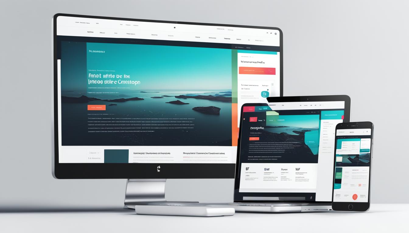
An example of a user-friendly mobile website design can be seen in the image below:
By implementing these tips, you can create a mobile-friendly website that provides a seamless user experience, resulting in increased engagement and conversions. Keep in mind that mobile website design is an ongoing process, so regularly analyze user behavior and make necessary adjustments to continuously improve your mobile presence.
The Impact of Mobile-Friendly Websites on SEO
Mobile-friendly websites play a crucial role in improving SEO ranking and visibility. With Google’s algorithm update prioritizing mobile-friendly sites, optimizing your website for mobile devices is essential for higher search engine rankings. By implementing responsive design and ensuring fast loading times, you can significantly enhance your chances of ranking higher in search results.
According to Google, mobile-friendliness is now a critical factor in determining search engine rankings. Websites that provide a seamless mobile experience are more likely to attract organic traffic and stay ahead of the competition. Mobile optimization is no longer a choice but a necessity in the digital landscape.
“In today’s mobile-first world, having a mobile-friendly website is no longer an option. It’s a must-have for businesses looking to improve their online visibility and attract more organic traffic.” – Google
Having a mobile-friendly website has a direct impact on user experience and engagement. Websites that are optimized for mobile devices offer improved navigation, readability, and overall functionality. These factors contribute to a positive user experience, which, in turn, leads to increased website traffic, longer dwell times, and higher conversion rates.
To provide a visual representation of the impact of mobile-friendly websites on SEO ranking, take a look at the table below:
| Website | Mobile-Friendly | SEO Ranking |
|---|---|---|
| Website A | No | Lower |
| Website B | Yes | Higher |
| Website C | Yes | Higher |
As seen in the table, websites that are mobile-friendly (Website B and Website C) have significantly higher SEO rankings compared to non-mobile-friendly websites (Website A). This highlights the importance of mobile optimization in improving search engine rankings and achieving online success.
By adopting a mobile-first approach and utilizing responsive design techniques, businesses can ensure their websites are accessible to users across all devices. This approach not only boosts SEO rankings but also enhances user experience and encourages repeat visits and conversions.
Next, we’ll explore the benefits of responsive design for mobile devices and how it can further improve the user experience on your website.

The Benefits of Responsive Design for Mobile
Responsive design is the key to creating mobile-friendly websites that provide an optimal user experience on any device. With its ability to adapt to various screen sizes, resolutions, and devices, responsive design ensures that your website looks and functions seamlessly on smartphones, tablets, and desktop computers.
One of the primary advantages of responsive design is its screen adaptability. Your website’s layout, elements, and content automatically adjust to fit different screen dimensions, eliminating the need for separate mobile and desktop versions. This flexibility allows you to reach a wider audience and ensures that your website remains visually appealing and easy to navigate, regardless of the device being used.
Device compatibility is another significant benefit of responsive design. By employing this approach, you can ensure that your website is compatible with a wide range of devices, including iOS and Android smartphones, iPads, and various screen sizes and resolutions. This compatibility enhances your website’s accessibility and usability, allowing users to engage with your content seamlessly, regardless of their preferred device.
Improved user experience is at the core of responsive design. By optimizing your website for different devices, you create a user-friendly environment that encourages engagement and drives conversions. Responsive design improves readability, making it easier for users to consume your content without having to zoom or scroll excessively. It also enhances navigation, allowing users to intuitively find the information they need, resulting in a more positive and satisfying browsing experience.
With responsive design, your website benefits from faster loading times, which is crucial for mobile users who expect instant access to information. By optimizing images, minimizing unnecessary web elements, and adopting other techniques to improve loading speed, responsive design enhances the overall user experience and reduces bounce rates.
Responsive design ensures that your website looks and performs well on mobile, desktop, and tablet devices, providing a seamless experience for users across all platforms.
Implementing responsive design is an essential step toward creating a successful mobile-friendly website. By prioritizing screen adaptability, device compatibility, and an improved user experience, you can enhance your online presence, boost engagement, and drive conversions.
| Benefits of Responsive Design for Mobile |
|---|
| Screen Adaptability |
| Device Compatibility |
| Improved User Experience |
| Faster Loading Times |
By embracing responsive design, you can unlock the full potential of your website and deliver a seamless user experience across all devices. Take the next step in mobile optimization and ensure that your website is responsive and user-friendly for maximum impact.

Optimizing Website Loading Time for Mobile
Loading time is a critical factor in ensuring a seamless mobile user experience. With visitors expecting fast-loading pages, even a few seconds of delay can result in high bounce rates. To optimize your website’s loading time for mobile, follow these key strategies:
Minimize web elements:
Reduce the number of elements on your mobile website, such as unnecessary images and scripts, to streamline the loading process. Simplicity is key when it comes to mobile optimization.
Optimize images:
Compress and resize images to ensure they are optimized for mobile devices. Large images can significantly slow down loading times. Use image optimization tools to strike the right balance between image quality and file size.
Lazy loading:
Implement lazy loading techniques to prioritize the loading of content that is visible above the fold. By deferring the loading of non-essential elements, you can ensure that visitors have access to the most important information without unnecessary delays.
Avoid excessive design elements:
While a visually appealing design is important, too many design elements can significantly impact loading time. Avoid excessive use of animations, videos, or complex scripts that can slow down your website. Keep your design clean and optimized for mobile performance.
By implementing these optimization strategies, you can reduce website loading time and provide visitors with a fast and responsive mobile experience. This will not only improve user satisfaction but also contribute to better SEO rankings and increased conversions.

| Benefits of Optimized Loading Time for Mobile |
|---|
| Improved user experience |
| Reduced bounce rates |
| Higher SEO rankings |
| Increased conversions |
Creating User-Friendly Navigation for Mobile Websites
When it comes to mobile websites, navigation is crucial. A clear and concise menu is essential for enabling users to easily find what they’re looking for. Simplifying your site menu and prioritizing important information can significantly enhance the user experience. It’s important to avoid excessive scrolling and zooming, as they can lead to frustration and hinder navigation.
One key aspect of user-friendly navigation is consistency. Ensure that the navigation menu is consistent across all pages of your website. This makes it easier for users to understand and navigate your site, as they become familiar with its structure. Consistency also helps to build trust and credibility with your audience.
Easy access to the navigation menu is another crucial consideration for mobile websites. With the increasing use of touchscreens, it’s important to design your navigation menu so that it can be easily accessed with the touch of a finger. Consider the placement and size of your menu buttons to ensure they are easily tappable on mobile devices.
To further enhance the streamlined user experience, it can be helpful to implement features such as sticky navigation. This keeps the menu visible and accessible as users scroll through your site, eliminating the need to constantly scroll back to the top for navigation.
Key Considerations for Mobile Website Navigation:
- Create a clear and concise menu
- Prioritize important information
- Avoid excessive scrolling and zooming
- Ensure consistency across all pages
- Ensure easy access with touch-friendly design
- Consider implementing sticky navigation
By incorporating these user-friendly navigation practices into your mobile website design, you can provide a seamless and intuitive experience for your visitors. This will encourage them to explore your website further, increasing engagement and driving conversions.
“User-friendly navigation is like a roadmap that leads your visitors to their destination with ease and efficiency.”

| Pros | Cons |
|---|---|
| Enhanced user experience | Potential for design limitations |
| Easy access to information | Possible trade-offs with other components |
| Improved engagement and conversions | Potential learning curve for users |
| Streamlined navigation process | Requires careful planning and testing |
Designing Effective Call-to-Action Buttons for Mobile
Call-to-action buttons are essential for driving conversions on mobile websites. When designing these buttons, it’s crucial to prioritize mobile optimization, simplified forms, and easy data entry. By creating an intuitive and seamless user experience, you can significantly improve user engagement and increase conversion rates.
Designing User-Friendly Buttons
When designing call-to-action buttons for mobile, there are several key considerations to keep in mind:
- Easy Tapping: Make sure your buttons are easily tappable on mobile devices. Ensure they are large enough and have enough spacing to prevent accidental clicks.
- Clear Indication: Clearly indicate the desired action that the button represents. Use concise and action-oriented text, such as “Buy Now,” “Sign Up,” or “Contact Us.”
“The secret to high conversion rates lies in the design of your call-to-action buttons.”
Simplifying Forms and Data Entry
Complex and lengthy forms can deter users from completing the desired action. Simplify forms and minimize data entry requirements to make it easy for users to take action on their mobile devices. Use validation to ensure accurate data entry and minimize mistakes.
“By simplifying forms and streamlining data entry, you can significantly improve user experience and conversion rates.”
Example of an Effective Call-to-Action Button
Here’s an example of an effective call-to-action button for a mobile website:
| Button Design | Button Text | Action |
|---|---|---|
 |
Buy Now | Redirects users to the checkout page for a seamless purchase process. |
With a visually appealing design, clear and actionable text, and a well-defined purpose, this call-to-action button encourages users to make a purchase, resulting in improved conversion rates.
Mobile Optimization Strategies for Pop-Ups
Pop-ups can be a valuable tool for engaging users on mobile websites. However, it’s crucial to implement effective mobile optimization strategies to ensure a seamless user experience. By following Google’s guidelines and designing concise and clear pop-ups, you can enhance user engagement and drive desired actions.
When utilizing pop-ups on mobile, it’s important to ensure that they do not obstruct the entire screen. Instead, they should cover only a portion of the screen to avoid interrupting the user’s browsing experience. By implementing this strategy, you can maintain a balance between engaging users and respecting their browsing preferences.
Designing concise and clear pop-ups is also a key aspect of mobile optimization. Keep your pop-ups focused on a single goal, whether it’s capturing email addresses, promoting a limited-time offer, or encouraging app downloads. By streamlining your message, you can deliver a more impactful and persuasive pop-up experience to your mobile users.
“Implementing mobile optimization strategies for pop-ups can enhance user engagement and drive desired actions.”
In addition, it’s essential to target your pop-ups to specific audience segments and tailor the message accordingly. By segmenting your audience and personalizing your pop-ups, you can deliver more relevant content and increase the likelihood of users taking action.
To illustrate these strategies, consider the following example:
| Segment | Goal | Message |
|---|---|---|
| New Visitors | Newsletter Sign-Up | Subscribe to our newsletter and stay updated with the latest industry trends. |
| Returning Customers | Promotional Offer | Get 20% off your next purchase with our exclusive promo code. |
| Cart Abandoners | Discount Reminder | Finalize your purchase now and enjoy 10% off your entire order. |
By tailoring your pop-ups to different audience segments, you can deliver more personalized and compelling messages, increasing the chances of conversion.
Remember, mobile optimization is not about eliminating pop-ups altogether but rather implementing a user-friendly approach. By adhering to Google’s guidelines and tailoring your pop-ups, you can create a positive user experience while still leveraging the benefits of this powerful engagement tool.

In the next section, we’ll explore the importance of integrating mobile and desktop websites for a seamless user experience.
Integrating Mobile and Desktop Websites for Seamless User Experience
To provide a seamless user experience, it’s important to integrate your mobile and desktop websites. By ensuring consistent branding, layout, and content across both platforms, you can create a cohesive and user-friendly experience for your audience, regardless of the device they’re using.
One of the key components of integration is adopting a multi-device website design approach. This involves using responsive design techniques to adapt your website to different screen sizes, resolutions, and orientations. Responsive design ensures that your website looks and functions optimally on various devices, such as smartphones, tablets, and desktop computers. This adaptability is crucial for providing a consistent and engaging user experience.
Furthermore, implementing cross-platform web design strategies allows your website to maintain its functionality and design integrity across different operating systems and browsers. By ensuring compatibility, you can guarantee that users can access and interact with your website seamlessly, regardless of their preferred platform.
In addition to design consistency, it’s important to maintain consistent branding across your mobile and desktop websites. This includes using the same color scheme, typography, logo placement, and overall visual identity. Consistent branding enhances recognition and reinforces your brand image, creating a sense of trust and familiarity with your audience.
Benefits of integrating mobile and desktop websites:
- Enhanced user experience: By providing a consistent and user-friendly experience across all devices, you can ensure that visitors have a positive impression of your brand and are more likely to engage with your content.
- Improved accessibility: Integrating both platforms allows users to access your website from their preferred device, making it more convenient for them to browse and interact with your content.
- Efficient content management: By integrating your mobile and desktop websites, you can streamline your content management process, making it easier to update and maintain your website.
By integrating your mobile and desktop websites, you can create a seamless and user-friendly experience for your audience. This ensures that your brand remains consistent across all devices, while also improving accessibility and streamlining content management. Embrace the power of multi-device website design, cross-platform web design, and consistent branding to provide an optimal and user-centric online experience for your customers.

The Future of Mobile-Friendly Web Design
Mobile-friendly web design is constantly evolving to keep up with technology and user preferences. As more and more people rely on their mobile devices for accessing the internet, businesses need to adapt to this shift and prioritize mobile optimization.
One of the key trends in mobile-friendly web design is the mobile-first approach. This approach involves designing websites for mobile devices before considering the desktop version. By prioritizing mobile design, businesses can ensure that their websites are optimized for the smaller screens, touch interactions, and limited bandwidth commonly associated with mobile devices.
Another exciting aspect of the future of mobile-friendly web design is the emergence of new technologies. Augmented reality (AR) and voice search are two cutting-edge technologies that are revolutionizing the user experience on mobile devices.
AR allows users to interact with digital content in their real-world environment, enhancing engagement and providing unique experiences. Incorporating AR elements into web design can create immersive and interactive mobile experiences that captivate users and differentiate businesses from their competitors.
Voice search is also transforming how users interact with websites on mobile devices. As voice recognition technology improves, more and more people are using voice commands to search the internet, make purchases, and interact with apps. Optimizing websites for voice search involves understanding conversational language patterns and creating content that aligns with how users speak.
Overall, staying up to date with the latest mobile optimization trends and incorporating them into web design strategies is crucial for businesses that want to remain competitive in the digital landscape. By embracing the mobile-first approach and leveraging emerging technologies like AR and voice search, businesses can create cutting-edge web designs that provide seamless user experiences and drive engagement.
Mobile Optimization Trends
| Trend | Description |
|---|---|
| Mobile-First Approach | Prioritizing mobile design and optimizing websites for mobile devices before considering the desktop version. |
| Augmented Reality | Integrating AR elements into web design to create immersive and interactive mobile experiences. |
| Voice Search | Optimizing websites for voice commands and conversational language patterns. |

By staying ahead of these trends and embracing cutting-edge web design practices, businesses can deliver exceptional mobile experiences and drive user engagement.
Conclusion
Mobile optimization is a crucial aspect of web design for businesses looking to maximize their online presence. At WebsiteDesigner.Business, we understand the importance of providing a seamless and user-friendly experience across all devices. By optimizing your website for both mobile and desktop, you can ensure that your brand message reaches your target audience effectively.
Responsive design is key in creating a mobile-friendly website. By utilizing custom CSS and responsive layouts, you can adapt your website to fit different screen sizes and orientations, providing a consistent user experience. Fast loading times are also essential for keeping visitors engaged. By minimizing web elements and optimizing images, your website can load in three seconds or less, reducing bounce rates and increasing conversions.
Another vital aspect of mobile optimization is user-friendly navigation. Simplify your site menu, prioritize important information, and make it easy for users to find what they are looking for. Clear call-to-action buttons are also crucial in driving conversions. Design buttons that are easy to tap and clearly indicate the desired action, guiding users towards your business goals.
Lastly, integrating your mobile and desktop websites allows for a cohesive brand experience. Ensure that your branding, layout, and content are consistent across all platforms. Embrace the future of mobile-friendly web design by keeping up with emerging technologies and the mobile-first approach. By optimizing your online presence, you can stay ahead of the competition and provide innovative experiences for your audience.
FAQ
Why is it important to have a mobile-friendly website?
Having a mobile-friendly website is important because more than 75% of website visits come from mobile devices. A mobile-friendly website improves user experience, increases reach and visibility, reduces bounce rate, and boosts SEO ranking. It also leads to speedy loading times, higher conversion rates, increased online sales, and better social media shares.
What should I focus on when designing a mobile-friendly website?
When designing a mobile-friendly website, focus on simplicity and ease of use. Ensure your site loads quickly and is easy to navigate. Simplify your site menu, avoid excessive scrolling and zooming, and minimize the number of steps required to complete actions. Use click-to-call buttons, simplify forms, and encourage store visits with location buttons and maps. Keep your content limited and consistent across devices. Design your website to drive conversions and achieve your business goals.
How does having a mobile-friendly website impact SEO ranking?
Having a mobile-friendly website has a significant impact on SEO ranking. Google’s algorithm favors mobile-friendly sites, prioritizing them in search results. Websites with responsive design and fast loading times are more likely to rank higher. As of 2020, Google considers mobile-friendliness as a crucial factor in determining search engine rankings. By optimizing your website for mobile, you can improve your visibility, attract more organic traffic, and stay ahead of your competition in search engine rankings.
What is responsive design and why is it important for mobile?
Responsive design is the preferred approach for creating mobile-friendly websites. It allows your website to adapt to different screen sizes, resolutions, and devices. With responsive design, your website elements automatically adjust to provide the best user experience on any device. This improves readability, navigation, and overall functionality. Responsive design ensures your website looks and performs well on mobile, desktop, and tablet devices, providing a seamless experience for users across all platforms.
How can I optimize the loading time of my mobile website?
Loading time is crucial for mobile websites. Visitors expect fast-loading pages, and a delay of even a few seconds can lead to high bounce rates. To optimize loading time, minimize web elements, optimize images, and use lazy loading to prioritize content at the top of the page. Avoid excessive design elements that can slow down your website. By reducing loading time, you can improve the user experience and keep visitors engaged with your content.
How can I create user-friendly navigation for my mobile website?
Navigation is essential for mobile websites. Design a clear and concise menu that enables users to easily find what they’re looking for. Simplify your site menu and prioritize important information. Avoid excessive scrolling and zooming to ensure a streamlined user experience. Make sure the navigation is consistent across all pages and easy to access with the touch of a finger. User-friendly navigation enhances the overall user experience and encourages visitors to explore your website further.
How can I design effective call-to-action buttons for mobile?
Call-to-action buttons play a crucial role in driving conversions on mobile websites. Design buttons that are easy to tap and clearly indicate the desired action, whether it’s making a purchase, submitting a form, or contacting your business. Simplify forms and minimize data entry requirements to make it easy for users to take action on their mobile devices. Use validation to ensure accurate data entry and minimize mistakes. Effective call-to-action buttons improve user engagement and increase conversion rates.
How can I optimize pop-ups for a mobile website?
Pop-ups can be effective if used appropriately on mobile websites. Ensure that pop-ups are not obstructive and cover only a portion of the screen. Follow Google’s guidelines to avoid negatively impacting the user experience. Design concise and clear pop-ups with a single goal in mind. Target your pop-ups to specific audience segments and tailor the message accordingly. By implementing mobile optimization strategies for pop-ups, you can enhance user engagement and drive desired actions.
How can I integrate my mobile and desktop websites for a seamless user experience?
To provide a seamless user experience, it’s important to integrate your mobile and desktop websites. Ensure that your branding, layout, and content are consistent across both platforms. Use responsive design to adapt your website to different screen sizes and ensure compatibility on various devices. By integrating mobile and desktop websites, you can create a cohesive and user-friendly experience for your audience, regardless of the device they’re using.
What does the future hold for mobile-friendly web design?
Mobile-friendly web design is constantly evolving to keep up with technology and user preferences. The mobile-first approach, focusing on designing for mobile before desktop, is gaining popularity. Emerging technologies like augmented reality and voice search are shaping the future of mobile optimization. Keeping up with these trends and incorporating them into your web design strategy can help you stay ahead of the competition and provide innovative and user-centric experiences.
Leave a Reply