Did you know that mobile traffic data consumption grew by 74% in 2015 alone? With more than a billion mobile devices sold during that same period, it’s clear that mobile optimization is crucial for the success of your website.
Optimizing web design for mobile devices is more than just making your site look good on smaller screens. It’s about creating a seamless user experience that keeps visitors engaged and converts them into customers. Responsive web design, mobile-first design, and adaptive web design are all strategies that can help you achieve this.
When optimizing your web design for mobile, there are several key factors to consider. You need to ensure that your site is mobile-friendly with a responsive design that adapts to different screen sizes. Mobile usability is also crucial, as visitors should be able to navigate and interact with your site effortlessly on their mobile devices.
So how do you optimize your web design for mobile devices? Let’s explore some tips and strategies to help you win big in the mobile space.
Key Takeaways:
- Optimize your web design for mobile devices to keep up with the growing mobile traffic.
- Choose a responsive design that adapts to different screen sizes.
- Ensure mobile usability for a seamless user experience.
- Consider mobile-first design and adaptive web design strategies.
- Regularly test your mobile designs using tools like BrowserStack, StudioPress, and Divi’s Multi-Device Settings & Preview Modes.
Add iOS Icons and Splash Screens
Enhance the user experience of your WordPress website by adding custom iOS icons and splash screens. This feature is especially beneficial for iPhone and iPad users, as it allows them to save your website to their home screens and access it as a web app.
To add iOS icons to your website, you’ll need to modify the header.php file. This file contains the code that defines the structure and layout of your website’s header. By adding specific icons for different Apple devices, you can ensure that your website looks great on iOS devices.
To add iOS icons, use the “apple-touch-icon” rel attribute in your header.php file. This attribute specifies the URL of the icon image to be used for different devices. By providing icons in multiple sizes, you can ensure optimal display quality on various screen resolutions. Here is an example of the code:
<link rel="apple-touch-icon" sizes="57x57" href="icon-57x57.png">
<link rel="apple-touch-icon" sizes="72x72" href="icon-72x72.png">
<link rel="apple-touch-icon" sizes="114x114" href="icon-114x114.png">
<link rel="apple-touch-icon" sizes="144x144" href="icon-144x144.png">
Additionally, you can create a custom splash screen for your website on iOS devices. The splash screen is displayed briefly when users launch your website, creating a seamless and immersive experience. To add a custom splash screen, you can use the “apple-touch-startup-image” code in your header.php file. Here is an example:
<link rel="apple-touch-startup-image" href="startup-image-320x460.png" media="(device-width: 320px) and (device-height: 460px) and (-webkit-device-pixel-ratio: 1)">
<link rel="apple-touch-startup-image" href="startup-image-768x1004.png" media="(device-width: 768px) and (device-height: 1004px) and (-webkit-device-pixel-ratio: 1)">
<link rel="apple-touch-startup-image" href="startup-image-1024x748.png" media="(device-width: 1024px) and (device-height: 748px) and (-webkit-device-pixel-ratio: 1)">
Remember to replace the href attribute with the correct path to your icon and splash screen image files. By adding these iOS icons and splash screens, you can provide a more polished and professional look to your website, enhancing the overall user experience.
Use Multiple Image Sizes in Combination With Media Queries
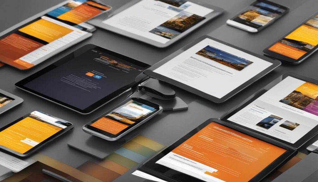
When it comes to responsive web design, media queries and multiple image sizes are crucial for ensuring a seamless user experience on various devices. Instead of relying on fixed pixel dimensions, designers should embrace relative units like ems and percentages to allow for flexible adaptation to different screen sizes and resolutions.
This mobile-first approach ensures that new devices with unique dimensions are accommodated, catering to the ever-changing landscape of mobile design. By avoiding popular device dimensions as guidelines and starting the design process from small viewports and working upwards, websites can better cater to the needs of their mobile users.
“Using relative units like ems and percentages allows images to scale proportionally, preventing them from overflowing or being too small on different screen sizes and resolutions.”
One crucial consideration when optimizing images for responsiveness is addressing the needs of Retina devices, which have higher resolutions. By adjusting media queries to adapt to these higher resolutions, designers can ensure that images appear crisp and clear on Retina screens.
Here’s an example of how multiple image sizes combined with media queries can improve the mobile experience:
| Device Width | Media Query Example | Image Size |
|---|---|---|
| <480px | @media (max-width: 480px) | 320px x 240px |
| 481px – 767px | @media (min-width: 481px) and (max-width: 767px) | 640px x 480px |
| >768px | @media (min-width: 768px) | 1024px x 768px |
Using various image sizes and corresponding media queries allows the website to serve the most appropriate image based on the user’s device width, optimizing both performance and visual quality. By implementing this technique, websites can ensure that images look great and load quickly, providing an optimal mobile experience.
Benefits of Using Multiple Image Sizes with Media Queries
- Improved page load times: By serving images appropriate for the user’s device, unnecessary bandwidth consumption is reduced, resulting in faster page load times.
- Enhanced user experience: Images that are properly sized and optimized for different devices ensure a visually appealing experience, promoting engagement and reducing bounce rates.
- Mobile-friendly design: Adapting images to different screen sizes and resolutions allows websites to meet the expectations of mobile users, who often consume content on-the-go.
By leveraging multiple image sizes in combination with media queries, designers can create a truly responsive web design that adapts to the ever-evolving landscape of mobile devices.
Optimize Your Images
Optimizing images is vital for enhancing the performance of your mobile website. Large image file sizes can significantly slow down page loading times and negatively impact the user experience. To address this issue, you can utilize image optimization techniques such as image compression and reducing file sizes.
There are several image optimization tools available that can help you achieve this, ensuring your mobile website is fast and responsive. One popular option is the EWWW Image Optimizer plugin, which optimizes images while preserving their quality. Alternatively, you can use standalone tools like TinyJPG and TinyPNG, both of which effectively compress image files without noticeable loss in quality.
These image optimization tools employ lossless compression techniques, selectively reducing the number of colors in images to minimize file sizes. With smaller image files, your mobile website will load faster, resulting in an improved user experience and increased engagement.
By optimizing your images, you not only enhance the performance of your mobile website but also improve its search engine rankings, as fast-loading websites are favored by search engines. Additionally, smaller image file sizes reduce bandwidth consumption, making your website more accessible to users with limited data plans.
When optimizing your images, it is crucial to maintain their quality and ensure they remain visually appealing. By making use of these image optimization tools, you can strike the perfect balance between file size and image quality, resulting in a powerful mobile website optimized for both speed and visual appeal.
Optimizing your images is essential for improving mobile website performance.
Consider Using SVGs

Scalable Vector Graphics (SVGs) offer a flexible and versatile solution for mobile-friendly web design. They use XML markup language and are particularly useful for creating simple graphics like logos, icons, and infographics. SVGs can be easily scaled without compromising quality, making them ideal for different viewports and screen sizes.
With SVGs, you can create visually appealing graphics that adapt seamlessly to mobile devices. Whether it’s a logo or an icon, SVGs ensure crisp and clear images on any screen. Additionally, SVGs can be animated using CSS, allowing for interactive and engaging user experiences.
Design tools such as Adobe Illustrator, Inkscape, and Sketch provide excellent support for creating and editing SVGs. These tools offer a wide range of features and functionalities, allowing designers to unleash their creativity and optimize graphics specifically for mobile.
To give you a better idea of the benefits and potential of SVGs, take a look at the example below:
“SVGs enable us to create stunning and scalable graphics that enhance the user experience on mobile devices. By utilizing XML markup language, we can easily edit and animate these graphics, making them a powerful tool for mobile optimization.”
| Advantages of Using SVGs for Mobile Optimization |
|---|
| 1. Scalability without loss of quality |
| 2. Perfect for simple graphics like logos and icons |
| 3. Easy animation using CSS |
| 4. Support from design tools like Adobe Illustrator, Inkscape, and Sketch |
Pick the Right Fonts
When it comes to mobile web design, font selection holds significant importance. The right choice of fonts can greatly enhance the user experience on mobile devices, especially considering the limited screen space and the need for legibility.
When selecting fonts for mobile designs, it is advisable to opt for simplistic and easily readable options. Thin or intricate letterforms should be avoided as they might become difficult to decipher on smaller screens. It’s essential to prioritize legibility by choosing fonts with adequate letter spacing, ensuring that each character is clear and distinct.
In addition to legibility, it is crucial to consider the responsive nature of mobile designs. Using font sizes measured in ems instead of pixels allows the text to adjust dynamically based on the viewport size, ensuring optimal readability on both small and large screens.
Another aspect to consider is the choice of font family. Sans serif fonts, which lack the small lines (known as serifs) at the ends of characters, tend to scale better across different resolutions. They are widely recognized as a popular choice for mobile designs due to their versatility and readability on smaller screens.
By carefully selecting fonts that prioritize readability, taking into account legibility, letter spacing, and responsive design principles, we can ensure that the text on mobile devices remains easily accessible and visually appealing.
Recommended Fonts for Mobile Design
| Font Family | Key Features |
|---|---|
| Arial | Simple, clean, and easy to read |
| Roboto | Modern, versatile, and legible at various sizes |
| Open Sans | Readable on both small and large screens |
| Lato | Clear, friendly, and suitable for long-form content |
In conclusion, choosing the right fonts for mobile web design is crucial for providing users with an optimal reading experience on small screens. By prioritizing readability, avoiding thin letterforms, and selecting appropriate fonts, we can create mobile designs that are visually appealing, engaging, and user-friendly.
Treat Text as Part of the UI
In mobile web design, text plays a crucial role as part of the user interface. By treating text with the same level of importance as other UI elements, we can enhance the overall user experience. Consider the following strategies to optimize text layout, readability, and responsiveness:
Manageable Character Limit
When designing text for mobile devices, it’s essential to ensure a manageable character limit per line. Typically, the ideal range falls between 45-75 characters per line. This can be achieved by using relative units like ems instead of pixels. By utilizing media queries, we can adjust the text layout based on the viewport size, ensuring optimal readability.
Utilize CSS3 Values
To maintain consistent font size across different viewports, CSS3 values such as vw (viewport width), vh (viewport height), and vhmin (minimum of the viewport height or width) can be utilized. These values allow the font size to scale proportionally with the container size, enhancing text readability on mobile devices.
Maximize Text Readability
Text readability is vital for mobile users who may be viewing content on smaller screens. By prioritizing legibility, we can enhance the user’s reading experience. This includes selecting appropriate font styles, sizes, and colors. Sans-serif fonts are generally preferred for their scalability across different resolutions. Additionally, maintaining adequate contrast between the text and background improves readability, ensuring that users can access and consume the content effortlessly.
Remember, text should be an integral component of the user interface in mobile web design. By implementing strategies like manageable character limits, CSS3 values, and prioritizing text readability, we can create a seamless and enjoyable user experience on mobile devices.
By focusing on these principles of text design, we can optimize the readability and usability of our mobile websites, enhancing the overall user experience.
Use Contrasting Colors to Your Advantage
Contrast is a vital element in web design, especially when it comes to optimizing websites for mobile devices. By effectively utilizing contrasting colors, you can highlight important elements and enhance the overall readability of your website. Simple combinations like white text on a black background can be highly effective, but don’t be afraid to experiment with clashing colors in specific design contexts.
Design guidelines play a crucial role in ensuring the visual appeal and accessibility of your website. To ensure compliance with these guidelines, you can employ online contrast checkers. These tools evaluate the contrast between the chosen colors and determine whether they have adequate contrast for optimal visual experience. By doing so, you can achieve a harmonious balance between aesthetics and readability, creating a more engaging and user-friendly website.
“Contrast brings attention and enhances visual hierarchy, making it easier for users to navigate and consume content on your website.”
Color Schemes and Readability
When selecting color schemes, it’s important to consider their impact on readability. Certain color combinations may appear pleasing to the eye but can compromise the legibility of your content. To ensure readability, choose colors that provide a clear contrast between the text and background. This allows users to easily distinguish and comprehend the information presented on your website.
Color psychology also comes into play when designing your website. Colors evoke specific emotions and associations in users, influencing their overall perception and engagement. By carefully selecting contrasting colors, you can create a visually captivating experience that resonates with your audience and enhances their interaction with your website.
Design Guidelines and Best Practices
Design guidelines serve as a roadmap to help you create visually appealing and functional websites. They provide valuable insights into color theory, user experience, and accessibility. By following these guidelines, you ensure that your website meets industry standards and provides an optimal experience for all users.
Here are some design guidelines to consider when incorporating contrasting colors:
- Ensure sufficient contrast between text and background, especially for users with visual impairments.
- Avoid using similar colors that may cause confusion or hinder legibility.
- Use high-contrast color combinations for important call-to-action buttons or links to make them stand out.
Online Contrast Checkers
To help you determine the contrast levels between different colors, there are several online tools available. These contrast checkers analyze the color contrast ratios and provide recommendations based on industry standards and accessibility guidelines. Here are a few popular online contrast checkers:
- Contrast Ratio
- WebAIM Contrast Checker
- Accessible Colors
Using these tools, you can ensure that your color choices meet the necessary contrast requirements, enhancing the overall usability and accessibility of your website.
By leveraging the power of contrasting colors, you can create visually striking and user-friendly web designs. Remember to consider readability, adhere to design guidelines, and utilize online contrast checkers to optimize the visual experience for every visitor.
| Common Color Combinations | Use Case |
|---|---|
| Black text on white background | Standard readability and simplicity |
| White text on black background | Dramatic and modern designs |
| Complementary colors | Highlighting important elements and creating visual impact |
| Analogous colors | Creating a harmonious color scheme with a subtle contrast |
Design Mobile Menus
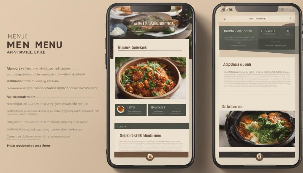
Designing mobile menus is crucial for creating a seamless browsing experience on mobile devices. We understand the importance of optimizing menus for mobile resolutions, and that’s why we recommend using WordPress plugins like Superfly and Hero Menu. These plugins provide extensive customization options, allowing you to tailor menus specifically for mobile devices.
Superfly and Hero Menu offer responsive menus that adapt to different screen sizes, ensuring optimal navigation regardless of the device your website visitors use. With the option to create icon-based vertical menus, you can further enhance the user experience, making it easier for users to navigate your mobile site.
By utilizing these WordPress plugins, you can take full control over the design and functionality of your mobile menus, providing a smooth and efficient browsing experience for your mobile users.
Superfly Plugin Features
- Options to replace default menus with mobile-specific menus
- Responsive menu layouts that adapt to different screen sizes
- Icon-based vertical menus for enhanced navigation
- Highly customizable design options
Hero Menu Plugin Features
- Seamless integration with WordPress
- Customizable menu styles and animations
- Multiple responsive design options
- Support for icon-based vertical menus
These plugins empower you to create mobile menus that not only look great but also improve user experience and engagement on mobile devices. Don’t neglect the importance of mobile menus in your web design strategy. Invest in a user-friendly menu design that caters to the needs of your mobile audience, and you’ll see the positive impact on your website’s performance.
By designing mobile menus with responsive and user-friendly features, you can ensure that your website is accessible and enjoyable for all users, regardless of the device they use. Prioritize mobile optimization, and you’ll gain a competitive edge in today’s mobile-focused digital landscape.
Use CSS3 Instead of Images (Where Possible)
In mobile web design, CSS3 can be a powerful tool for optimizing the performance and loading speed of your website. By utilizing CSS3 properties like gradients, shadows, and transformations, you can create visually appealing elements that were traditionally represented by images.
One of the key advantages of using CSS3 instead of images is the reduction in HTTP requests. As images require separate requests to load, using CSS3 properties reduces the number of requests, resulting in faster loading times for your mobile site.
Additionally, CSS3 allows for greater control over the file sizes of your website. By using CSS3 to create elements, you can avoid the need for large image files, further optimizing the performance of your mobile site.
Here are some examples of elements that can be created using CSS3 instead of images:
“CSS3 offers a wide range of features that can replace images and improve the overall performance of your mobile website. By utilizing gradients, shadows, and transformations, we can create visually stunning elements without compromising loading speed.”
- Buttons and navigation menus
- Background patterns and textures
- Icons and logos
In addition to improving performance, using CSS3 instead of images also enhances the responsiveness of your website. With CSS3, elements can adapt seamlessly to different screen sizes and orientations, creating a better user experience on mobile devices.
However, it’s important to consider browser compatibility when using CSS3. While most modern browsers support CSS3, older browsers may have limited support. In such cases, providing fallback options or alternative solutions is recommended.
When considering the use of CSS3 instead of images in your mobile web design, keep in mind the following benefits:
“CSS3 provides a more efficient way to create visually appealing elements, reduce HTTP requests, and improve the overall performance of your mobile website. By utilizing CSS3 properties, we can optimize loading times and enhance the responsiveness of your site.”
By leveraging the power of CSS3, you can optimize your mobile website’s performance and deliver a seamless user experience to your visitors.
Conclusion
Optimizing web design for mobile devices has numerous benefits for businesses. With responsive design, websites can seamlessly adapt to various screen sizes and devices, ensuring an enhanced user experience. This optimization not only improves usability and engagement but also boosts search engine rankings and increases conversions.
By prioritizing mobile responsiveness, businesses gain a competitive advantage in the digital landscape. They eliminate the need for separate mobile apps, reducing development and maintenance costs. Moreover, mobile optimization makes websites more accessible to a wide range of users, improving their overall accessibility.
Mobile optimization also plays a crucial role in website maintenance. It allows businesses to cater to the growing mobile user base without compromising on the user interface or functionality. By investing in mobile app development and implementing responsive design, businesses can maximize their online presence and achieve better results in terms of user experience, SEO rankings, and conversions.
FAQ
Why is it important to optimize web design for mobile devices?
Optimizing web design for mobile devices is crucial because mobile traffic has significantly increased, with more than a billion devices sold in recent years. Mobile-friendly web design ensures a seamless browsing experience for mobile users and helps businesses reach a wider audience.
How can I add iOS icons and splash screens to my WordPress website?
Custom iOS icons and splash screens can enhance the user experience for iPhone and iPad users. By adding specific icons and splash screens, users can save the website to their home screens. This can be achieved by modifying the “header.php” file and using the appropriate code.
Why should I use multiple image sizes combined with media queries?
Using multiple image sizes and media queries is essential for responsive web design. This approach allows website designs to adapt to different screen sizes and resolutions, ensuring optimal display on various devices. It ensures that new devices with different dimensions are accommodated without compromising the user experience.
How can I optimize my images for mobile websites?
Optimizing images is crucial for improving mobile website performance. Large image file sizes can slow down page loading times, negatively impacting user experience. Image optimization tools like EWWW Image Optimizer, TinyJPG, and TinyPNG can significantly reduce file sizes while preserving image quality, resulting in faster-loading pages.
What are Scalable Vector Graphics (SVGs) and why should I consider using them?
SVGs are flexible and versatile graphics that use XML markup language. They are scalable and can adapt to different viewports without compromising quality. SVGs are particularly useful for simple graphics like logos and icons in mobile web design. Design tools like Adobe Illustrator, Inkscape, and Sketch provide support for creating and editing SVGs.
How does font selection impact mobile web design?
Font selection plays a significant role in mobile web design. Simplistic and easily readable fonts are preferred for mobile devices due to limited screen space and the need for legibility. Fonts with adequate letter spacing should be chosen to enhance readability. Using relative units like “ems” for font sizes enables text to adjust based on viewport size, ensuring a responsive design across different devices.
How can I optimize text as part of the user interface for mobile web design?
Text should be treated as an integral part of the user interface in mobile web design. Media queries can be used to ensure a manageable character limit per line, typically between 45-75 characters. CSS3 values like “vw,” “vh,” and “vhmin” can be utilized to maintain font size relative to the container size across different viewports. This approach maximizes text readability and maintains a consistent user experience on mobile devices.
Why is contrast important in mobile web design?
Contrast plays a crucial role in mobile optimization. Using contrasting colors helps highlight important elements and improves readability. It is important to choose colors that meet design guidelines for adequate contrast. Online contrast checkers can be used to ensure the chosen colors provide optimal visual experience for users.
How can I design mobile menus for better navigation?
Designing mobile menus is essential for a seamless mobile browsing experience. WordPress offers plugins like Superfly and Hero Menu that allow customization of menus for mobile resolutions. These plugins provide options to replace default menus or create additional menus tailored for mobile devices. Responsive menus and icon-based vertical menus enhance navigation on mobile devices.
Can CSS3 be used instead of images in mobile web design?
Yes, CSS3 can be used instead of images to optimize mobile web design. By utilizing CSS3 properties like gradients, shadows, and transformations, elements traditionally represented by images can be created using code. This approach reduces the number of HTTP requests and file sizes, leading to improved performance and faster loading times.
What are the benefits of optimizing web design for mobile devices?
Optimizing web design for mobile devices offers several benefits, including improved user experience, better search engine rankings, increased conversions, and a competitive advantage. Responsive design ensures that websites adapt seamlessly to various screen sizes and devices, eliminating the need for separate mobile apps and reducing maintenance costs. Mobile optimization enhances usability, engagement, and accessibility, making businesses more accessible to a wider range of users.
Leave a Reply