When it comes to web design for cell phones, creating a user-friendly and visually appealing experience is crucial for engaging your audience and driving business success. In this article, we will explore the different approaches to mobile web design and provide valuable insights on how to optimize your website for cell phone users.
Key Takeaways:
- Understanding the differences between mobile-friendly, mobile-optimized, and responsive web design is essential for creating an optimal user experience.
- Mobile-friendly design focuses on adapting a desktop website to display properly on smaller screens.
- Mobile-optimized design is specifically tailored for smartphone use, with simplified layouts and streamlined navigation.
- Responsive design allows a website to automatically adjust and adapt to different screen sizes and devices.
- Choosing the right design approach depends on your specific needs, budget, and desired level of flexibility.
Mobile-Friendly Web Design
When it comes to designing a website that caters to cell phone users, mobile-friendly web design plays a crucial role. By making the necessary adjustments and tweaks, you can ensure that your website provides a seamless and user-friendly experience on smartphones. To achieve this, there are several key principles to keep in mind:
- Readable Fonts: Choosing fonts that are easy to read on smaller screens is essential. Avoid using intricate or small fonts that may strain the eyes of mobile users.
- Image Compression: Compressing images helps reduce their file size, leading to faster loading times. This is particularly important on mobile devices, where users expect quick access to information.
- Element Arrangement: Carefully arranging page elements is crucial to prevent overlapping and ensure a cohesive layout. Make sure that all elements fit well within the screen and avoid clutter.
- Collapsible Sections: Incorporating collapsible sections allows users to expand or collapse specific areas of content, enhancing the overall user experience. This feature proves especially useful for hiding non-essential information and reducing the scroll length for mobile users.
By implementing these mobile-friendly design principles, you can create a website that is optimized for cell phone users. It ensures that your site is easily navigable, visually appealing, and provides a seamless browsing experience on mobile devices.
To illustrate the importance of mobile-friendly web design, let’s take a look at an informative table:
| Advantages of Mobile-Friendly Web Design | Benefits for Cell Phone Users |
|---|---|
| Improved readability with appropriate font size | Enhanced user experience, no eye strain |
| Quick loading times due to image compression | Reduced waiting time, faster access to information |
| Thoughtful element arrangement, no overlapping | Easy navigation, organized content |
| Collapsible sections for non-essential information | Less scrolling, focused content consumption |

Mobile-Optimized Web Design

When it comes to creating a seamless browsing experience for cell phone users, mobile-optimized web design is the key. Unlike mobile-friendly design, which focuses on adapting desktop websites for mobile use, mobile-optimized design takes a more advanced approach. It involves designing a website specifically for smartphones, starting from the smallest screen size and expanding to larger screens, such as desktops.
Mobile-optimized websites prioritize simplicity and ease of use. They feature layouts that utilize single columns, minimizing the need for excessive scrolling and providing a better user experience. Navigation is simplified, reducing the need for excessive typing or complex menu structures. This ensures that cell phone users can quickly and easily navigate the website to find the information they need.
In addition to layout and navigation, mobile-optimized web design also focuses on reducing features and graphics. By prioritizing loading speeds, mobile-optimized sites remove any unnecessary elements that can slow down the website. This includes reducing graphics and avoiding the use of heavy effects or plugins like Adobe Flash. By minimizing the use of these elements, mobile-optimized websites ensure faster loading times and a smoother browsing experience for cell phone users.
“Mobile-optimized web design ensures a seamless and user-friendly experience for cell phone users by simplifying layouts, streamlining navigation, and reducing loading times.”
One of the key aspects of mobile-optimized web design is the use of HTML5. This modern web development language provides better compatibility with mobile devices, ensuring that the website functions properly on various smartphones. HTML5 also allows for greater flexibility and interactivity, enabling the integration of multimedia elements and dynamic content that engages users.
Lastly, pop-ups are avoided in mobile-optimized web design. Pop-ups can be difficult to view and close on small screens, leading to a frustrating user experience. By eliminating pop-ups, mobile-optimized websites prioritize uninterrupted browsing, ensuring that users can easily access the information they need without any distractions or obstacles.
In summary, mobile-optimized web design is a crucial approach for creating an optimal browsing experience for cell phone users. It focuses on simplifying layouts, streamlining navigation, reducing loading times, and avoiding pop-ups. By adopting these techniques, you can design a mobile-optimized website that caters to the unique needs and limitations of cell phone users, ensuring a seamless and enjoyable browsing experience.
Responsive Web Design
In today’s digital landscape, it’s essential to create websites that provide a seamless and optimized experience across different devices. This is where responsive web design comes into play. By embracing responsive web design principles, we can ensure that our website adapts and responds to the device it is being viewed on, whether it’s a desktop, tablet, or smartphone.
One of the key aspects of responsive web design is the use of multiple breakpoints. These breakpoints define how the layout of the website changes at different screen sizes. By strategically placing breakpoints, we can ensure that the content is displayed in the most effective and user-friendly manner, regardless of the device being used.
A responsive website also focuses on fluidity and movement. This means that elements on the page should gracefully transition and adjust as the screen size changes. By incorporating fluid design elements, we create a dynamic and visually appealing website that engages users and enhances their browsing experience.
Responsive web design also addresses the differences between desktop and mobile devices. A website designed for desktop viewing may not be optimized for mobile use. With responsive design, we can make sure that our website functions well on both large and small screens, providing a consistent and enjoyable user experience across platforms.
Another advantage of responsive web design is its adaptability. Websites that are responsively designed are flexible and capable of handling new devices and screen sizes that may emerge in the future. This adaptability ensures that our website remains relevant and accessible, no matter how technology evolves.
Responsive web design allows us to create a versatile and adaptable website that caters to the needs of users on various devices.
The Benefits of Responsive Web Design
There are several benefits to embracing responsive web design:
- Improved User Experience: With responsive design, users can easily navigate and interact with the website on any device, leading to increased engagement and satisfaction.
- Higher Search Engine Rankings: Search engines prioritize mobile-friendly websites. By implementing responsive design, we can improve our website’s visibility in search engine results pages.
- Cost and Time Efficiency: Rather than creating multiple versions of our website for different devices, responsive design allows us to maintain a single site that works well on all screens, reducing development, maintenance, and updating costs.
- Consistent Branding: A responsive website ensures that our branding elements, such as logos, colors, and fonts, remain consistent across all devices, reinforcing our brand identity.
- Increased Conversion Rates: By providing a seamless user experience, responsive web design can lead to higher conversion rates, as users are more likely to take desired actions, such as making a purchase or submitting a form.
Overall, responsive web design is essential for creating a website that is adaptable, user-friendly, and future-proof. By embracing this design approach, we can provide an optimal browsing experience for visitors on any device, leading to increased engagement, improved search engine visibility, and ultimately, business success.
| Benefits of Responsive Web Design |
|---|
| Improved User Experience |
| Higher Search Engine Rankings |
| Cost and Time Efficiency |
| Consistent Branding |
| Increased Conversion Rates |

Choosing the Right Design Approach
When it comes to deciding on the design approach for your website, there are three options to consider: mobile-friendly, mobile-optimized, and responsive design. Each approach offers its own set of advantages and considerations, and the right choice depends on your specific needs, business requirements, and budget.
Mobile-friendly design is a cost-effective solution for businesses that want to adapt their existing desktop websites to mobile screens. By making adjustments and tweaks to the existing design, the website can be made compatible with mobile devices. This approach is ideal for businesses with limited budget and resources, as it allows for a streamlined mobile experience without the need for a complete overhaul.
Mobile-optimized design takes a more advanced approach and is specifically tailored for smartphones. It involves designing a website from scratch, starting with the smallest screen size and gradually scaling up. With a focus on simplicity and ease of use, mobile-optimized websites prioritize single column layouts, minimal typing requirements, and intuitive navigation. While this approach offers a customized and seamless mobile experience, it may require a higher budget and expertise to implement.
Responsive design offers the most adaptability and flexibility, as it allows a website to automatically adjust and respond to different screen sizes and devices. With multiple breakpoints defined in the design, the layout fluidly adapts to provide an optimal user experience on any device. Responsive design ensures that your website looks and functions well on both mobile and desktop screens. It offers a comprehensive and future-proof solution, but it requires more complex development and can be more expensive.
Comparison of Design Approaches:
| Design Approach | Advantages | Considerations |
|---|---|---|
| Mobile-Friendly |
|
|
| Mobile-Optimized |
|
|
| Responsive |
|
|
Ultimately, the right design approach depends on your unique needs, business requirements, and budget. Mobile-friendly design may be a suitable choice if you need a quick and cost-effective solution for adapting your existing website. If you want a tailored experience specifically for smartphones, mobile-optimized design offers enhanced functionality and user experience. Responsive design provides the most adaptability, ensuring your website looks and functions well on any device, but it requires a higher level of expertise and investment.
By evaluating your specific needs and resources, you can make an informed decision and choose the design approach that best suits your web design for cell phone users.

Key Points to Consider:
– Mobile-friendly design is cost-effective and suitable for adapting existing websites to mobile screens.
– Mobile-optimized design offers a tailored and advanced mobile experience.
– Responsive design provides the most adaptability but requires complex development and higher investment.
– Evaluate your needs, business requirements, and budget to choose the right design approach.
Importance of Mobile-Friendly Design
In today’s digital landscape, mobile-friendly design plays a crucial role in website success. With approximately 60% of internet traffic coming from mobile devices, it is paramount to create websites that are accessible and user-friendly on smaller screens. Mobile-friendly websites not only improve search engine ranking but also offer a better viewing experience for users.
When a website is mobile-friendly, it adapts to different screen sizes, ensuring that content is displayed correctly and users can easily navigate and interact with the site. This responsive layout enhances user engagement and increases the chances of converting mobile visitors into customers.

By prioritizing mobile-friendly design, you create a seamless and user-friendly experience for your audience, ultimately driving better results for your online presence and business.
Key Practices for Mobile-Friendly Design
To optimize your website for mobile devices, there are several key practices to consider. Implementing a responsive layout ensures that your site can adapt to different screen sizes and display content effectively.
Website speed optimization is crucial for mobile users, as faster loading times translate to better user experience. Compressing images reduces file sizes and improves loading speeds. By using image compression techniques, you can ensure that your website loads quickly and efficiently on mobile devices.
Avoiding the use of Adobe Flash and opting for HTML5 allows for better compatibility with mobile devices. This ensures that your website is accessible to a wider audience and provides a seamless experience for cell phone users.
Pop-ups should be avoided, as they can disrupt the user experience on smaller screens. By avoiding pop-ups, you can create a more user-friendly website that caters to the needs of cell phone users.
Ensuring button size and placement cater to thumb navigation can enhance user interaction. By making buttons easily clickable and accessible, you can improve the overall user experience on mobile devices.
Using a readable font is essential for mobile-friendly design. Fonts should be legible on smaller screens, ensuring that users can easily read the content of your website.
Spacing out links and decluttering the web design are additional practices that contribute to a mobile-friendly website. By providing enough space between links, you can prevent accidental clicks and improve user navigation. Decluttering the design ensures that the website is clean and organized, making it easier for users to find the information they need.

By incorporating these key practices into your web design, you can create a mobile-friendly website that delivers a seamless and enjoyable experience for cell phone users. These practices not only improve user experience but also contribute to better search engine rankings and increased user engagement.
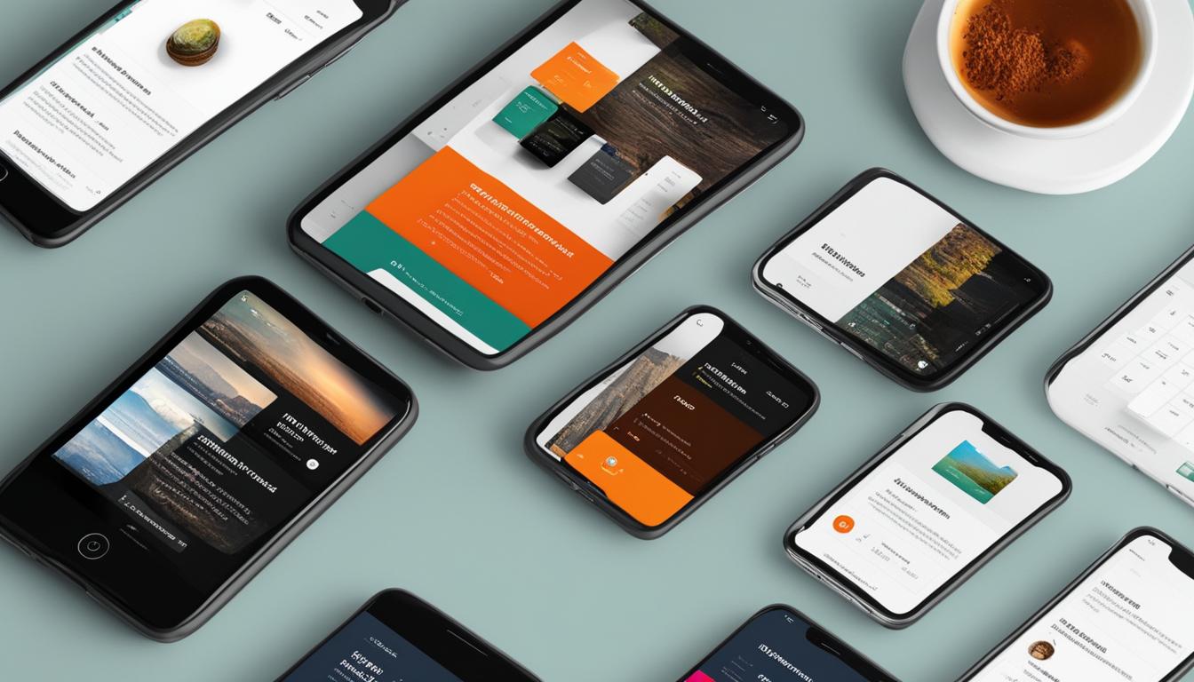
Why Mobile-First Design Is Essential
In today’s mobile-centric world, mobile-first design has become essential for website development. With the widespread usage of smartphones and their role as the primary device for internet access, mobile traffic has surpassed desktop usage. As a result, users now expect websites to be optimized specifically for mobile devices, providing a seamless and intuitive user experience.
Failure to prioritize mobile-first design can have negative consequences, including losing potential customers and missing out on valuable opportunities. A poor mobile user experience can lead to high bounce rates and low conversion rates, ultimately impacting your business’s success.
Mobile-first design ensures that your website is tailored for small screens, loads quickly, and provides a user-friendly interface. By adopting this approach, you cater to the needs of mobile users and deliver a positive browsing experience that encourages engagement and conversion.
Design adaptability is a key aspect of mobile-first design. Websites developed with a mobile-first mindset are created with a responsive layout, meaning they adapt seamlessly to different screen sizes and resolutions. This flexibility is crucial in today’s dynamic digital landscape, where users access websites on various devices, including smartphones, tablets, and laptops.
By prioritizing mobile-first design, you can optimize your website for mobile devices, improve user engagement, and stay ahead of the competition. Mobile-first design is not just a trend; it’s a necessity in today’s mobile-driven world.

As the image above demonstrates, mobile-first design is about creating a user-centric experience that caters to the needs and expectations of mobile users. It emphasizes the importance of placing mobile users at the forefront of the design process, ensuring that their browsing experience is seamless and enjoyable.
Importance of an SEO-Friendly Mobile Design
In today’s digital landscape, having an SEO-friendly mobile design is essential for ensuring the success of your website. Not only does it provide a seamless and user-friendly experience, but it also plays a crucial role in improving your search engine ranking and attracting organic traffic.
One of the key reasons why an SEO-friendly mobile design is important is because of Google’s mobile-first index. This index prioritizes websites that are mobile-optimized and responsive, as they offer better user experience and adaptability across different devices.
With the majority of internet traffic coming from mobile devices, it is crucial to have a website that is optimized for mobile users. By providing a mobile-optimized experience, you can reach a larger audience and engage with them effectively.
Optimizing your website for mobile devices not only improves user experience but also enhances your search engine visibility. Search engines like Google value websites that are mobile-friendly and reward them with higher rankings. This, in turn, increases your chances of attracting organic traffic and driving more visitors to your site.
When users have a positive experience on your mobile-optimized website, they are more likely to stay longer, explore more pages, and convert into customers. The seamless browsing experience provided by an SEO-friendly mobile design helps in building trust and credibility with your audience.
By prioritizing mobile optimization, you can ensure that your website is accessible, user-friendly, and provides a consistent experience across different devices. With a responsive design that adapts to different screen sizes, your website can cater to the needs of mobile users and deliver a seamless browsing experience.
“An SEO-friendly mobile design is crucial for improving search engine ranking, attracting organic traffic, and delivering a seamless browsing experience.”
In summary, an SEO-friendly mobile design is essential for both user experience and search engine ranking. With the majority of internet traffic coming from mobile devices, it is crucial to optimize your website to cater to mobile users. By doing so, you can improve your search engine visibility, attract organic traffic, and provide a seamless browsing experience for cell phone users.

Benefits of an SEO-Friendly Mobile Design
| Benefits | Description |
|---|---|
| Improved search engine ranking | An optimized mobile design helps boost your search engine visibility and rankings, making it easier for potential customers to find your website. |
| Increased organic traffic | With a mobile-friendly website, you can attract more organic traffic from mobile users, who make up the majority of internet users. |
| Enhanced user experience | A seamless and user-friendly mobile design contributes to a positive user experience, leading to longer site visits and higher conversion rates. |
| Expanded audience reach | By optimizing your website for mobile users, you can reach a wider audience and engage with them across different devices. |
Benefits of an Optimal Web Design for Cell Phone Users
An optimal web design for cell phone users offers numerous benefits for your online presence and business success. By ensuring seamless browsing on any device, you can provide a positive and engaging user experience, increasing user satisfaction and encouraging longer site visits.
A user-friendly mobile design also improves conversion rates, as visitors are more likely to take desired actions, such as making a purchase or submitting a contact form. When users find it easy to navigate and interact with your website on their cell phones, they are more inclined to complete transactions, driving your conversion optimization efforts.
To achieve an optimal web design for cell phone users, it’s recommended to work with professional designers who have expertise in mobile web design services. Professional designers understand the intricacies of creating a web design that is visually appealing, functional, and optimized for different devices, ensuring a seamless browsing experience for your target audience. With their skills and experience, they can collaborate with you to create a website that aligns with your branding and business goals, creating a strong online presence and enhancing your credibility.
Key Benefits of Optimal Web Design for Cell Phone Users:
- Seamless browsing experience on any device
- Improved user satisfaction and engagement
- Increased conversion rates and business growth
- Enhanced online presence and credibility
By working with professional designers and adopting an optimal web design for cell phone users, you can ensure that your website effectively caters to the needs and preferences of your mobile audience, driving your business forward in the digital landscape.
| Benefits | Description |
|---|---|
| Seamless Browsing | Ensure a smooth and frustration-free browsing experience for cell phone users, regardless of the device they are using, leading to increased engagement and user satisfaction. |
| Engaging User Experience | Deliver a visually appealing and intuitive mobile design that captivates visitors, encouraging them to stay longer on your site and explore your offerings. |
| Conversion Optimization | Improve the likelihood of visitors taking desired actions on your website, such as making purchases, filling out forms, or subscribing to your services, resulting in increased conversions and revenue. |
| Online Presence | Develop a strong online presence that showcases your brand’s professionalism and commitment to providing an exceptional mobile experience, attracting and retaining customers. |
| Professional Designers | Partner with experienced and skilled designers who specialize in mobile web design services, ensuring that your website is expertly crafted to meet the unique needs of cell phone users. |

Conclusion
In today’s mobile-dominated landscape, web design for cell phone users is essential for a successful online presence. Whether you choose mobile-friendly, mobile-optimized, or responsive design, the key is to create a website that offers a seamless and user-friendly experience on mobile devices. By prioritizing elements such as responsive layouts, fast loading times, image compression, readable fonts, appropriate button size and placement, and a decluttered design, you can ensure optimal performance for cell phone users.
Optimizing your website for mobile devices provides numerous benefits, including enhanced user engagement, improved search engine ranking, and increased conversion rates. Mobile optimization is crucial to cater to the ever-growing number of users accessing the internet on their smartphones. By working with professional designers who specialize in mobile web design, you can create an exceptional web design that aligns with your branding and business objectives.
At WebsiteDesigner.Business, we understand the importance of web design for cell phone users. Our team of skilled designers is ready to assist you in creating a responsive and mobile-friendly website that will captivate your audience and drive business growth. Visit our website today to order your plan and embark on the journey of creating an exceptional web design for cell phone users.
FAQ
What is the difference between mobile-friendly, mobile-optimized, and responsive design?
Mobile-friendly design focuses on adapting a desktop website to display properly on smaller screens, while mobile-optimized design is specifically tailored for smartphone use. Responsive design allows a website to automatically adjust and adapt to different screen sizes and devices.
What are the key principles of mobile-friendly web design?
Key principles include using readable fonts, compressing images for faster loading times, avoiding certain effects that don’t work well on mobile, and carefully arranging page elements to prevent overlapping. Collapsible sections can also be used to hide non-essential information.
How does mobile-optimized web design differ from mobile-friendly design?
Mobile-optimized web design is specifically tailored for smartphone use, with layouts that utilize single columns, minimal typing requirements, and simple navigation. Mobile-optimized sites often reduce features and graphics, prioritize white space, and avoid using Adobe Flash.
What is responsive web design?
Responsive web design is an approach that enables a website to adapt and respond to the device it is being viewed on. Responsive websites automatically reformat themselves to ensure optimal display and functionality on various screen sizes and devices.
How do I choose the right design approach for my website?
The decision depends on various factors such as your specific needs, business requirements, and budget. Mobile-friendly design may be a cost-effective solution for adapting existing desktop websites. Mobile-optimized design is more advanced and tailored specifically for smartphones. Responsive design offers the most adaptability and flexibility.
Why is mobile-friendly design important?
Mobile devices account for a significant portion of internet traffic, and having a mobile-friendly website improves search engine ranking and provides a better viewing experience for users. With a responsive layout, a mobile-friendly website adapts to different screen sizes, ensuring content is displayed properly and that users can easily navigate and interact with the site.
What are some key practices for mobile-friendly design?
Key practices include implementing a responsive layout, optimizing website speed, compressing images, using HTML5 instead of Adobe Flash, avoiding pop-ups, ensuring appropriate button size and placement, using a readable font, spacing out links, and decluttering the web design.
Why is mobile-first design essential?
With the majority of internet traffic coming from mobile devices, mobile-first design ensures that your website is tailored for small screens, loads quickly, and provides an intuitive and seamless user experience for cell phone users. Prioritizing mobile-first design can help you reach a wider audience, improve user engagement, and stay ahead of the competition.
Why is an SEO-friendly mobile design important?
An SEO-friendly mobile design is crucial for improving search engine ranking and attracting organic traffic. Google’s mobile-first index prioritizes mobile-optimized and responsive websites for their better user experience and adaptability across devices. By optimizing your website for mobile devices, you can improve your search engine visibility, drive more organic traffic, and increase conversions and revenue.
What are the benefits of an optimal web design for cell phone users?
An optimal web design for cell phone users provides a positive and engaging user experience, increasing user satisfaction and encouraging longer site visits. It also improves conversion rates, as visitors are more likely to take desired actions. By working with professional designers who specialize in mobile web design services, you can create a visually appealing and functional website that elevates your online presence and drives business growth.
Leave a Reply