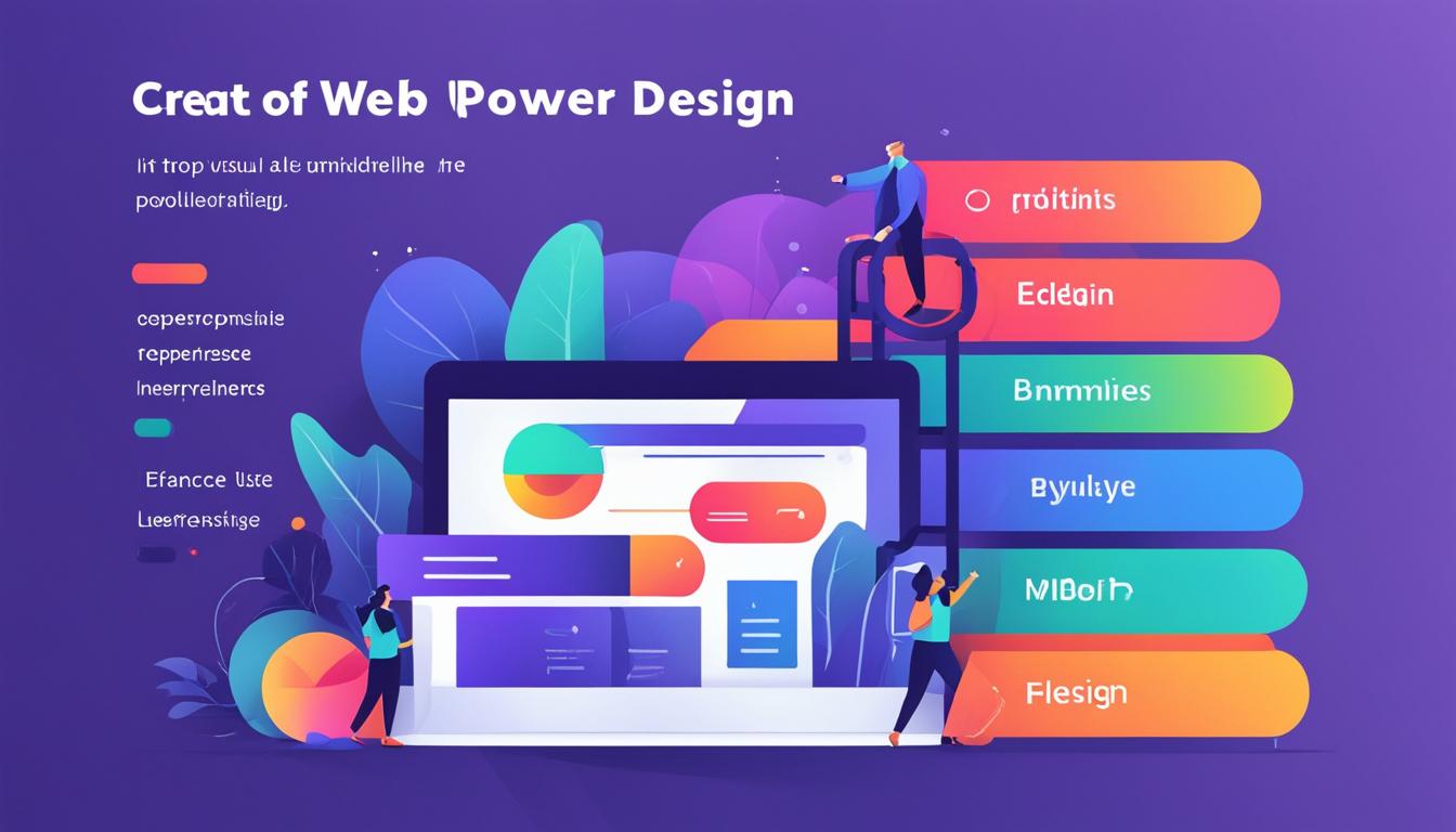
When it comes to designing or redesigning a website, there’s more to consider than just its appearance. The success of a website relies on a combination of aesthetics, usability, and user experience. That’s where web design rules come in. By following these rules, you can create a website that not only looks great but also engages visitors and drives conversions.
Web design rules are guidelines and best practices that ensure your website is easy to navigate, visually appealing, and accessible to all users. These rules cover various aspects of web design, including simplicity, visual hierarchy, navigability, consistency, responsivity, accessibility, conventionality, and credibility.
Key Takeaways:
- Simplicity is key in web design. Remove unnecessary elements and create a clean, user-friendly interface.
- Create a visual hierarchy to guide users’ attention and highlight important content.
- Enhance navigability for a seamless user experience.
- Maintain consistency throughout your website for a cohesive look and feel.
- Ensure responsivity to provide a mobile-friendly experience for users on different devices.
By understanding and implementing these web design rules and best practices, you can elevate your website to its maximum potential. Don’t miss out on the opportunity to engage visitors and achieve your goals. Choose our web design services today, and let us help you create a website that stands out from the competition.
Simplify Your Design with the Principle of Simplicity
The principle of simplicity is a fundamental aspect of effective web design. By removing unnecessary design elements and creating a clean, user-friendly interface, you can enhance the usability and user experience of your website. Here are some web design tips for incorporating simplicity into your design:
- Use a limited color palette: Stick to a few carefully chosen colors that complement your brand identity and create a coherent visual experience for your users. Avoid using too many colors, as it can be overwhelming and distract from the content.
- Employ legible typefaces: Choose fonts that are easy to read on various screen sizes. Opt for clear typography and appropriate font sizes to ensure that your content is accessible to all users.
- Incorporate graphics with a purpose: When adding images or illustrations to your website, make sure they serve a functional purpose. Visual elements should enhance the user experience and convey information efficiently.
By simplifying your design, you make it easier for users to navigate your website and find what they are looking for. A clutter-free interface allows visitors to focus on the essential elements, increasing engagement and conversions. Remember, simplicity is key in effective web design strategies.
“Simplicity is the ultimate sophistication.” – Leonardo da Vinci
To illustrate the impact of simplicity in web design, take a look at the following comparison:
| Website A | Website B |
|---|---|
 |
 |
|
|
As you can see, Website B, with its simplified design principles, provides a more visually appealing and user-friendly experience. Visitors are more likely to engage with a website that is easy to navigate, visually pleasing, and devoid of unnecessary distractions. Incorporating simplicity into your web design is one of the most effective strategies for optimizing your site’s performance.
Create a Visual Hierarchy to Guide Users
When it comes to web design principles and best practices, creating a visual hierarchy is essential. A visual hierarchy organizes the elements on your website in a way that guides users’ attention and prioritizes important content. By strategically using size, color, and positioning, you can highlight key elements such as headings and call-to-action buttons, making them stand out and increasing their visibility and importance.
Size plays a crucial role in creating a visual hierarchy. Elements that are larger tend to draw more attention, so you can use this to your advantage. Make important headings and buttons larger to make them stand out from the rest of the content and guide users’ focus.
Color is another powerful tool for guiding users’ attention. Bright and bold colors naturally attract the eye, while muted or neutral colors tend to recede into the background. By using contrasting colors for important elements, like buttons or links, you can make them visually pop and draw users’ attention. However, be sure to maintain consistency and use colors that align with your brand identity.
Positioning is the third element of creating a visual hierarchy. By placing important elements higher on the page, such as in the top left corner or above the fold, you can ensure that users see them first. Eye-tracking studies have shown that users tend to scan webpages in an F-shaped pattern, so it’s best to place key content where it’s most likely to be seen.
Example of Visual Hierarchy:
| Element | Size | Color | Positioning |
|---|---|---|---|
| Heading | Larger | Contrasting | Above the fold |
| Call-to-action button | Larger | Contrasting | Above the fold |
| Secondary text | Smaller | Neutral | Below the main content |
By implementing these web design principles and best practices, you can create a visual hierarchy that guides users through your website and ensures that they focus on what’s most important. Remember, simplicity is key. Don’t overwhelm your users with too many elements competing for attention. Instead, use the power of size, color, and positioning to create a visually appealing and user-friendly browsing experience.

Enhance Navigability for a Seamless User Experience
Enhance Navigability for a Seamless User Experience
Intuitive navigation is a key aspect of effective web design. It helps users find the information they’re looking for quickly and easily, providing them with a seamless browsing experience. To ensure optimal navigability, it’s important to follow web design guidelines and implement best practices.
One of the fundamental principles of navigation is to keep it simple and consistent. This means using clear and concise labels for navigation menus and keeping the menu structure straightforward. Complex navigation can confuse users and make it difficult for them to find what they need.
To provide users with context while navigating your website, consider using breadcrumbs. Breadcrumbs display the user’s path from the homepage to the current page, making it easier for them to backtrack or explore related content. They enhance navigability and improve the overall user experience.
Incorporating a search bar on your website can also greatly enhance navigability. This allows users to search for specific keywords or phrases, enabling them to find relevant information more quickly. Keyword-based navigation ensures that users can directly access the content they are looking for, bypassing the need to navigate through menus and submenus.
By implementing these web design best practices, you can create a website that is easy to navigate, ensuring a seamless user experience. The table below summarizes these guidelines:
| Web Design Guidelines for Navigability |
|---|
| Keep the primary navigation simple and consistent |
| Use breadcrumbs to provide context |
| Include a search bar for keyword-based navigation |
With intuitive navigation, users will be able to navigate your website effortlessly, find the information they need, and have a positive overall experience. This will contribute to higher engagement, increased conversions, and a stronger online presence.

Maintain Consistency for a Cohesive Website
In order to create a website that is visually appealing and provides a seamless user experience, it is crucial to maintain consistency throughout the design. Consistency ensures a uniform look and feel across all pages, enhancing usability and making it easier for users to navigate your website.
When it comes to web design principles, consistency plays a key role in establishing trust and credibility with your audience. By maintaining consistent navigation, color schemes, typefaces, and page layouts, you create a cohesive website that promotes brand identity and helps users easily identify and interact with your content.
Consistency in navigation means ensuring that the placement and structure of menus and navigation elements remain the same across all pages. This allows users to quickly understand the site’s navigation system and easily find what they are looking for. Consistent color schemes create a harmonious visual experience and help reinforce your brand’s identity. Similarly, using consistent typefaces across your website contributes to a professional and polished look.
Page layouts are also an important component of maintaining consistency. By using consistent grids or templates, you can create a cohesive structure for your website pages, making it easier for users to understand and navigate the content. Consistent page layouts also contribute to a better user experience, as users become familiar with the overall structure and can find information more intuitively.
To illustrate the importance of maintaining consistency in web design, let’s take a look at an example:
“A website that has inconsistent navigation, with menus and links placed in different locations on each page, can be confusing and frustrating for users. This inconsistency can lead to higher bounce rates and lower conversion rates, as users struggle to find the information they need. On the other hand, a website that maintains consistent navigation, color schemes, typefaces, and page layouts creates a cohesive and intuitive browsing experience, encouraging users to explore more and engage with the content.”
By adhering to the principles of consistency in web design, you can create a cohesive and user-friendly website that not only looks great but also provides a seamless browsing experience. Consistency promotes usability and enhances the overall user experience, ultimately leading to higher engagement and better conversion rates.
Benefits of Maintaining Consistency in Web Design
| Benefits | |
|---|---|
| 1 | Enhanced usability and user experience |
| 2 | Established brand identity and credibility |
| 3 | Improved navigation and findability |
| 4 | Consistent visual appeal |
| 5 | Increased engagement and conversion rates |
By maintaining consistency in your web design, you create a harmonious and cohesive website that leaves a lasting impression on your users. Utilizing consistent navigation, color schemes, typefaces, and page layouts ensures that your website is easy to navigate, visually appealing, and reinforces your brand identity. Start implementing these web design rules and regulations today to maximize the potential of your website.

Ensure Responsivity for a Mobile-Friendly Experience
With a significant percentage of website views happening on mobile devices, it’s crucial to prioritize responsive design. By creating a flexible website structure that adapts to different screen sizes, we can provide a seamless user experience across all devices.
Responsive design allows your website to automatically adjust its layout, images, and content to fit the screen of the device being used. This ensures that your website looks and functions optimally whether it’s accessed on a desktop, laptop, tablet, or smartphone.
Create a Mobile-Friendly Layout
- Use a responsive grid system to organize your content and ensure it resizes correctly on different devices.
- Consider the size and placement of clickable elements such as buttons and links to accommodate touch interactions on mobile devices.
- Optimize images for mobile by compressing their file size without compromising quality. This reduces page load times on slower mobile networks.
Design for Mobile Usability
- Prioritize important content and calls-to-action in the mobile layout. Place them prominently at the top of the page, making them easily accessible.
- Streamline navigation by using collapsible menus or hamburger icons that expand when tapped.
- Ensure that your text is legible and that users can read it without zooming in on their mobile devices. Use a font size that is comfortable to read on smaller screens.

Benefits of Mobile Responsivity
According to Google, 61% of users are unlikely to return to a website that they had trouble accessing on their mobile devices. On the other hand, a mobile-friendly website is more likely to keep visitors engaged and increase conversions.
By prioritizing responsive design, you can:
- Improve user experience on mobile devices, leading to higher engagement and conversion rates.
- Enhance your website’s SEO performance, as search engines prioritize mobile-friendly websites in their rankings.
- Reach a wider audience, as an increasing number of users rely primarily on mobile devices for internet access.
Designing a website with mobile responsivity in mind is an essential best practice in today’s mobile-driven world. By ensuring that your website is accessible and user-friendly on all devices, you can provide a positive experience for your visitors and achieve your business goals.
Prioritize Accessibility for Inclusive Design
When it comes to web design, it’s crucial to prioritize accessibility to ensure that your website is usable for all users, including those with disabilities. By following web design guidelines and best practices, you can create an inclusive online experience for everyone.
One of the key resources for web accessibility is the Web Content Accessibility Guidelines (WCAG). These guidelines provide a comprehensive framework for making websites perceivable, operable, understandable, and robust. By adhering to WCAG, you can create a website that is accessible to individuals with visual impairments, hearing impairments, motor disabilities, and cognitive disabilities.
Here are some essential considerations for incorporating accessibility into your web design:
- Provide alternative text (alt text) for images to convey their meaning to users who cannot see them. Alt text should be descriptive and concise, conveying the purpose or context of the image.
- Ensure color contrast between text and background to improve legibility for users with visual impairments. Use WCAG-approved color contrast guidelines to determine the appropriate color combinations.
- Include captions and transcripts for videos to make them accessible to users who are deaf or hard of hearing. This ensures that the information in the videos is easily understood by all users.
- Use descriptive link text that accurately describes the destination or purpose of the link. Avoid generic phrases such as “click here” or “learn more,” which can be confusing for users relying on assistive technologies.
- Structure your website with headings and subheadings (H1, H2, H3, etc.) to create a logical and hierarchical organization of content. This helps screen readers and users with cognitive disabilities navigate and understand the information better.
Web design should strive to include everyone, regardless of their abilities. By prioritizing accessibility, you not only ensure compliance with legal requirements but also demonstrate a commitment to creating an inclusive digital space.
Image:

| Benefits of Accessibility in Web Design | Impact on Users |
|---|---|
| 1. Inclusive user experience | Improves usability for individuals with disabilities |
| 2. Expanded audience reach | Captures users who require accessible design |
| 3. Legal compliance | Avoids potential lawsuits and legal repercussions |
| 4. Improved search engine optimization (SEO) | Enhances website visibility and ranking |
| 5. Positive brand perception | Portrays the company as inclusive and socially responsible |
Embrace Conventionality for Familiarity and Trust
When it comes to web design, creativity is essential, but it’s equally important to follow web design conventions. By adhering to established best practices, we can provide users with a familiar and trustworthy experience.
First and foremost, it’s crucial to place the main navigation at the top of the website. This convention ensures that users can easily find their way around, improving overall usability. Placing the navigation menu prominently at the top of each page helps users quickly locate the information they’re seeking.
Another convention to embrace is making the logo clickable. This simple practice has become a standard in web design, allowing users to return to the homepage with a single click. It enhances user experience by providing consistent and intuitive navigation.
Using recognizable icons is also an effective way to create familiarity and improve usability. Icons have become a universal language for web users, allowing them to quickly understand and interact with various functions on a website. Consistently using recognized icons helps reduce cognitive load and enhances user engagement.
“Following web design conventions not only creates a familiar user experience but also instills trust in our website visitors. Conventions serve as cues, allowing users to feel comfortable and confident as they navigate through our website.”
Incorporating these conventional design elements may seem basic, but they have a profound impact on user experience and overall usability. By embracing conventionality, we make it easier for users to engage with our website and build trust in our brand.

| Benefits of Embracing Conventionality: |
|---|
| 1. Familiarity for users |
| 2. Enhanced usability |
| 3. Improved user engagement |
| 4. Establishes trust and credibility |
Conclusion
By following the essential web design principles outlined in this article, you can create a visually stunning website that is optimized for usability and delivers an exceptional user experience. Our best practices for web design, including simplicity, visual hierarchy, navigability, consistency, responsivity, accessibility, conventionality, and credibility, will maximize your site’s potential and set it apart from the competition.
When it comes to web design, it’s not just about making your website beautiful—although that’s important too— but also ensuring that it is easy to navigate, loads quickly, and provides valuable content. Implementing simplicity in your design helps eliminate clutter and keeps the focus on what matters most. Create a visual hierarchy that guides users’ attention to the most important elements, such as headings and call-to-action buttons, to optimize engagement and conversions.
In addition, prioritize navigability to enable users to find what they need effortlessly. Consistency across your website enhances usability and builds trust with your audience. Ensure that your website is fully responsive to provide a seamless user experience across devices.
Accessibility is paramount, allowing all users, regardless of disabilities, to navigate and interact with your website effectively. By adhering to web design best practices and standards, such as the Web Content Accessibility Guidelines (WCAG), you can achieve inclusivity and broaden your audience.
Finally, embrace conventionality to create a sense of familiarity and trustworthiness. Implementing standard web design conventions, such as a top navigation bar and clickable logo, enhances user experience and ensures your website is easy to navigate. By combining these principles with credibility-enhancing features, you can establish your website as a reliable source of information and a trusted brand.
Ready to take your web design to the next level? Visit our website, WebsiteDesigner.Business, to learn more about our comprehensive web design plans and start maximizing your site’s potential today.
FAQ
What are the fundamental guidelines for web design?
The fundamental guidelines for web design include simplicity, visual hierarchy, navigability, consistency, responsivity, accessibility, conventionality, and credibility.
What does the principle of simplicity entail in web design?
The principle of simplicity in web design focuses on removing unnecessary design elements and creating a clean, user-friendly interface.
How can visual hierarchy be used to guide users?
Visual hierarchy organizes website elements through size, color, and positioning to highlight important content and guide users’ attention.
How can I enhance navigability for a seamless user experience?
Enhancing navigability involves keeping the primary navigation simple and consistent, using breadcrumbs for context, and including a search bar for keyword-based navigation.
Why is consistency important in website design?
Consistency in website design ensures a uniform look and feel across all pages, enhancing usability and user experience.
What is responsive design?
Responsive design involves creating a flexible website structure that adapts to different screen sizes, ensuring a seamless user experience across devices.
How can I prioritize accessibility in web design?
Prioritizing accessibility involves following the Web Content Accessibility Guidelines (WCAG) to ensure a website is usable for all users, including those with disabilities.
Why is conventionality important in web design?
Embracing conventionality in web design provides a familiar and trustworthy user experience by following established web design conventions.
Leave a Reply